
A system for wealth management
with TIFIN
TIFIN is a fintech startup that is committed to bringing AI-assisted personalisation to the investment experience. By mid-2022, they began consolidating their multiple offerings into a single flagship product called TIFIN Wealth.
I was responsible for leading the visual design on this product, creating a design system early in the product’s development and advocating for its use across the board.
My role
Visual design lead
Timeline
March - December 2022
How TIFIN Wealth works
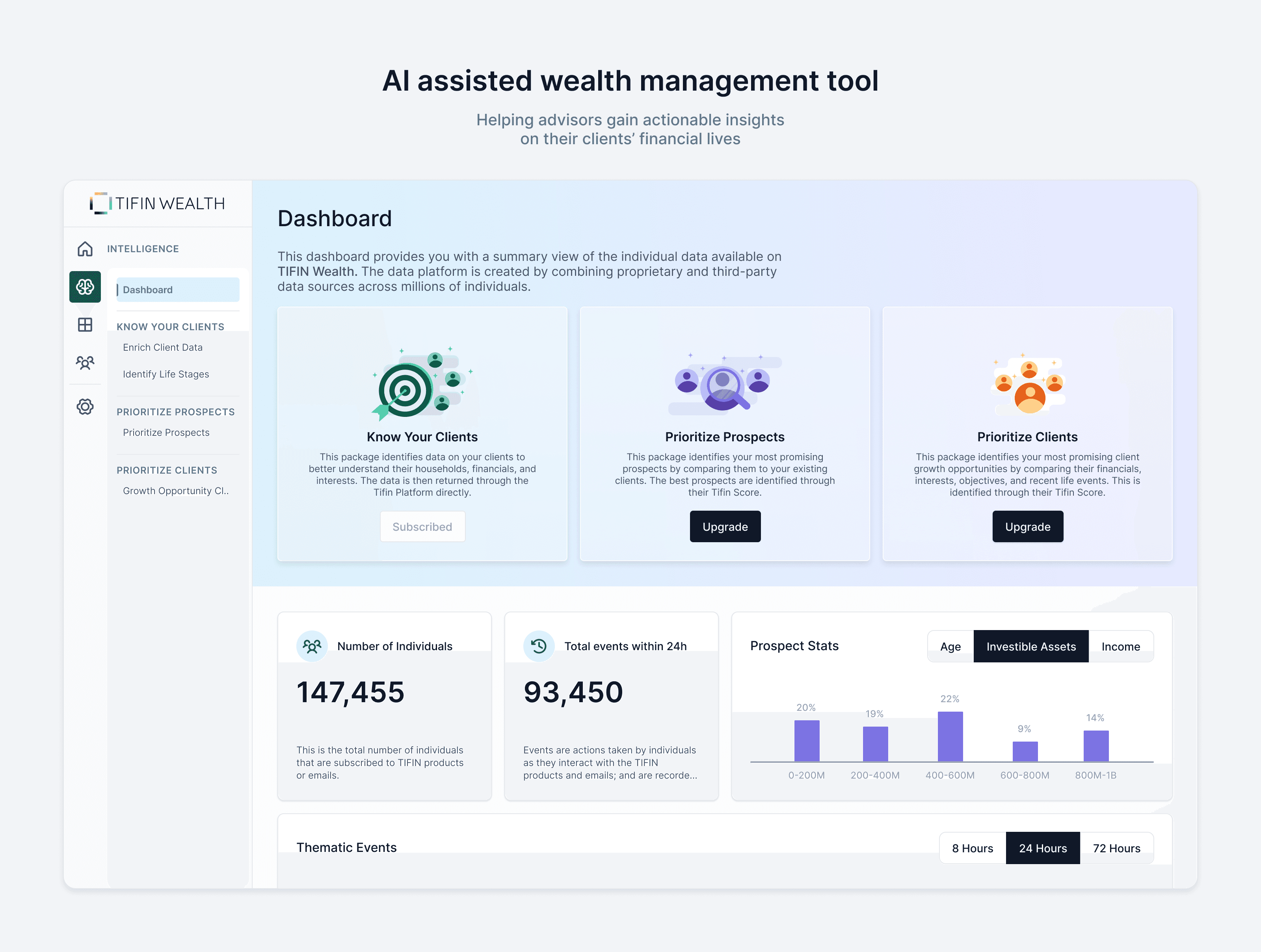
Financial advisors use a range of tools to do their jobs. These tools help them schedule meetings, manage relationships and portfolios, and provide personalised financial advice to their clients.
TIFIN Wealth goes a few steps further to create a versatile, multi-purposed tool. Advisors can use the platform to collect data about their clients, understand their investing goals and recommend the best wealth management strategies. Proprietary algorithms work alongside advisors to help them deliver financial advice that is tailored to their clients' needs.
🐘 The elephant(s) in the room
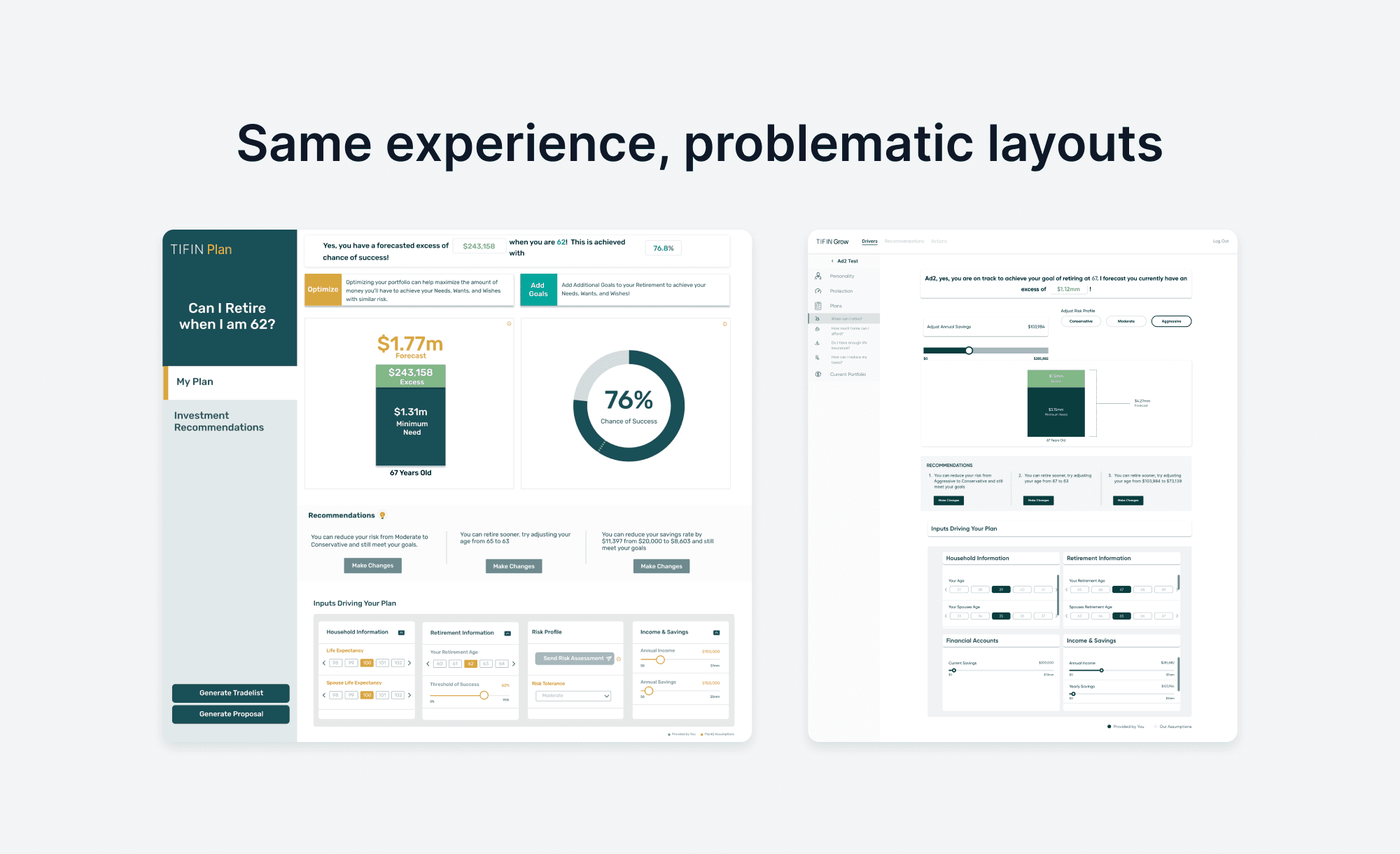
As a visual designer, my most daunting task was to translate multiple interfaces into a single, robust one. I began this exercise by skimming through TIFIN’s products, looking for components and patterns that would repeat themselves.
After an initial UI audit, I spoke to a practicing financial advisor about what they consider most important in the UI of the tools they use. I also took some cues from other competing platforms.
There were other challenges facing the design team. With the launch of such a behemoth product facing us, how were we going to maintain the quality of user experience, feature after feature, across the board?
🦴 We need a skeleton
One of the answers to (a lot of) our questions seemed to be a design system. We needed a common set of tools that we could all use. Something that would be flexible and lean enough to stitch disjointed, legacy experiences into seamless flows. Not a super expansive one with all the bells and whistles, but one that is 'just enough'.
Over 9 months, I led the creation of this system. I started by building a UI kit in Figma, organising assets by atomic design principles. I then created extensive documentation that held anatomies, behaviours and usage rules. This evolved into a living set of guidelines that had to be maintained through constant feedback and iteration
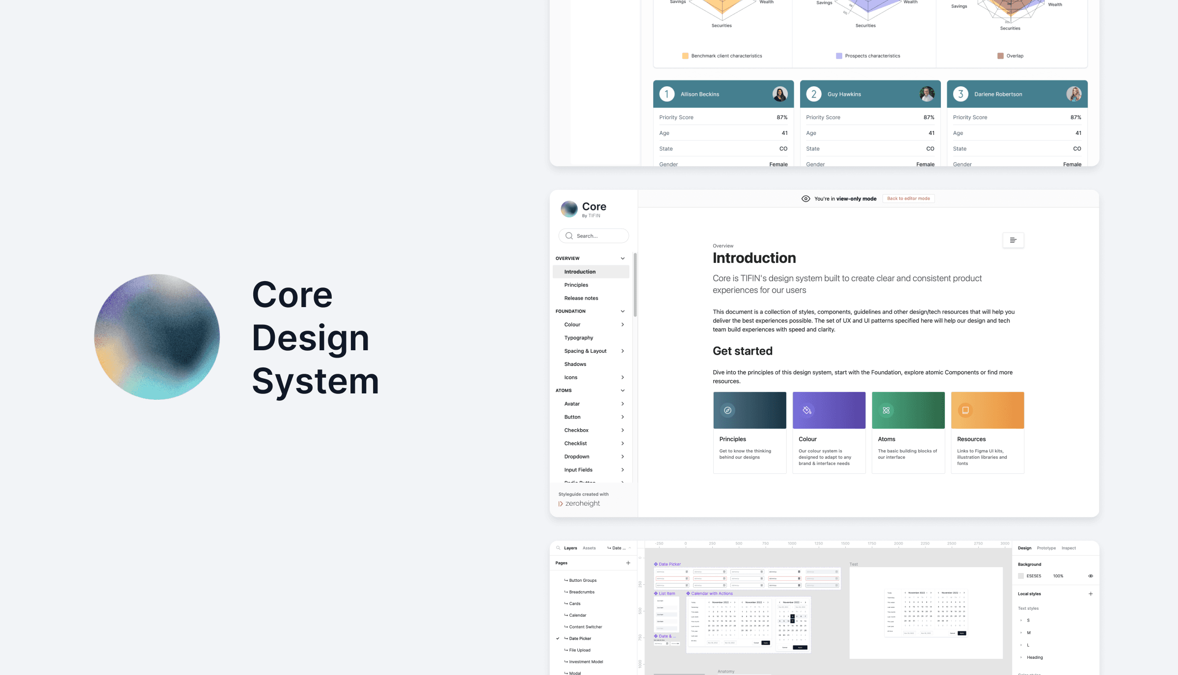
Along the way, I also created file organisation conventions, trained the design team in using the system and normalised the use of the documentation.
🥅 Setting some goals
I began by setting a few principles for the interface of the product. From our conversations with the former advisors in our organisation, we knew that B2B fintech applications such as this had to feel…
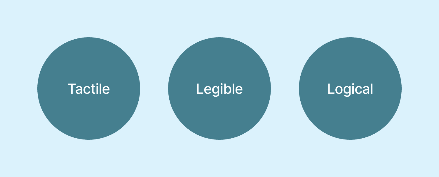
Complex screens are a given in advisor tools, but we needed organisation and clarity above all.
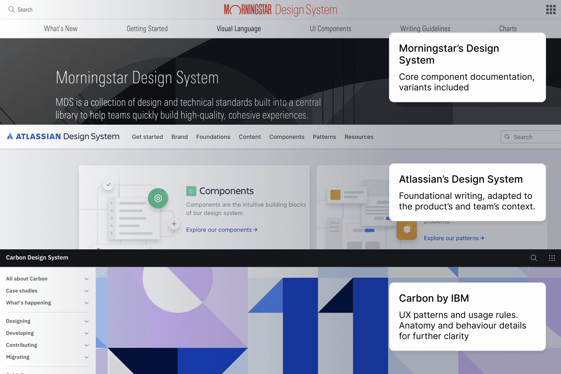
I looked at giants such as IBM, Morningstar and Atlassian to learn about their approach in creating massive systems. This gave me an idea of what would make for a strong documentation structure, which we could then adapt to our needs.
A core concept I wanted to build on from the start was that of lean, smart base components. This meant highly customisable atoms that could create a network of rich, interlinked organisms that would update in real-time. This made me leverage the best features of our tools.
Complex components like these are made up of smaller components…
…all of which have a number of handy properties, making for a smarter workflow
⚛️ Atoms and all that
The precursor to our design system was atomic design. Although we had used these principles before, we were able to see it truly shine as we created a system of this scale. It became the foundation for consistency and collaboration.
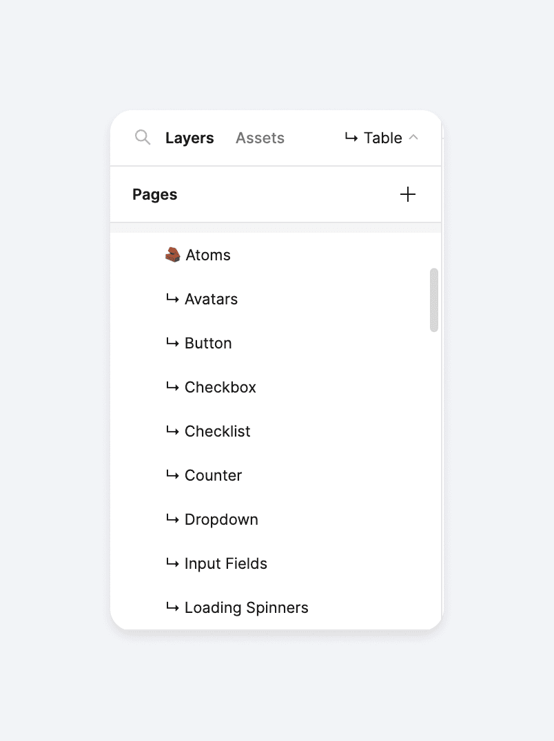
The design system file was set up for the atomic way of working
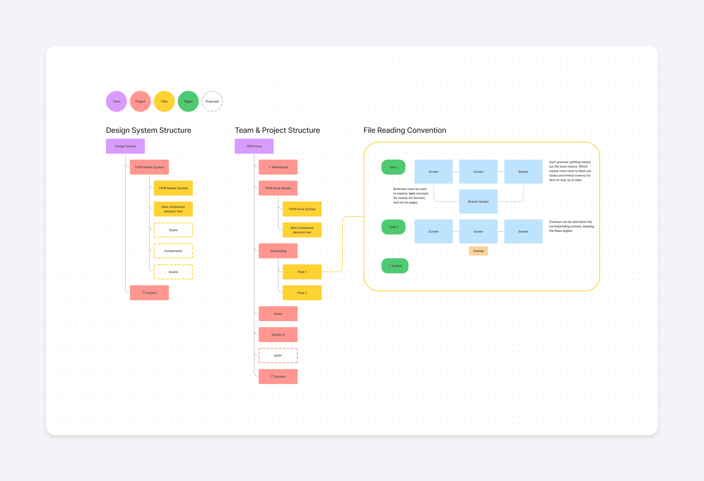
We also came up with detailed file/project organisation conventions
Each component was tested on a playground before deployment
This way of thinking started giving us a shared vocabulary while working with our developers, which also led to better handoffs.
👀 Some highlights
I made sure to implement some best practices while designing the components, which addressed some glaring UX errors that were baked into the legacy products.
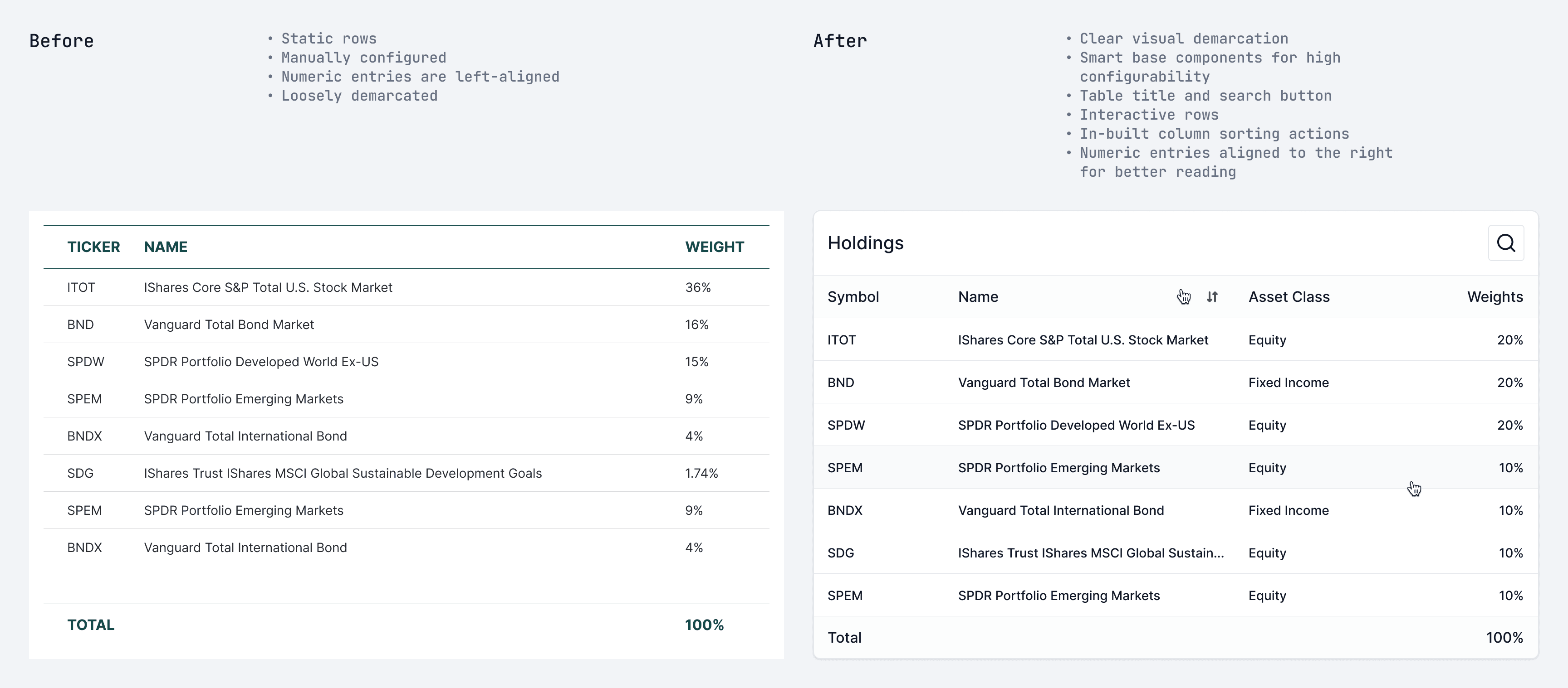
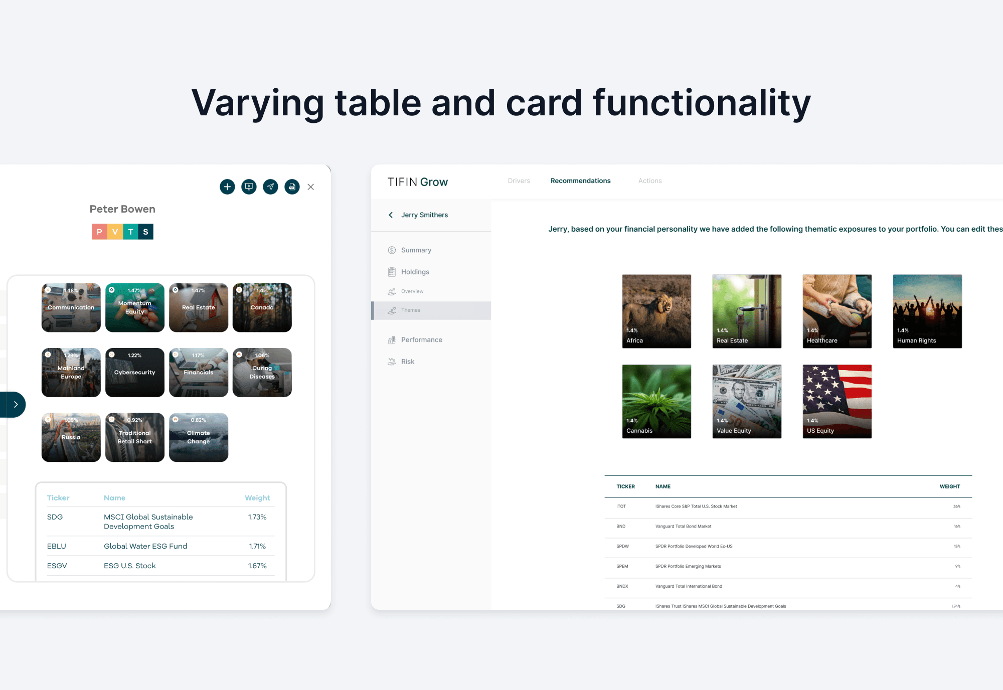
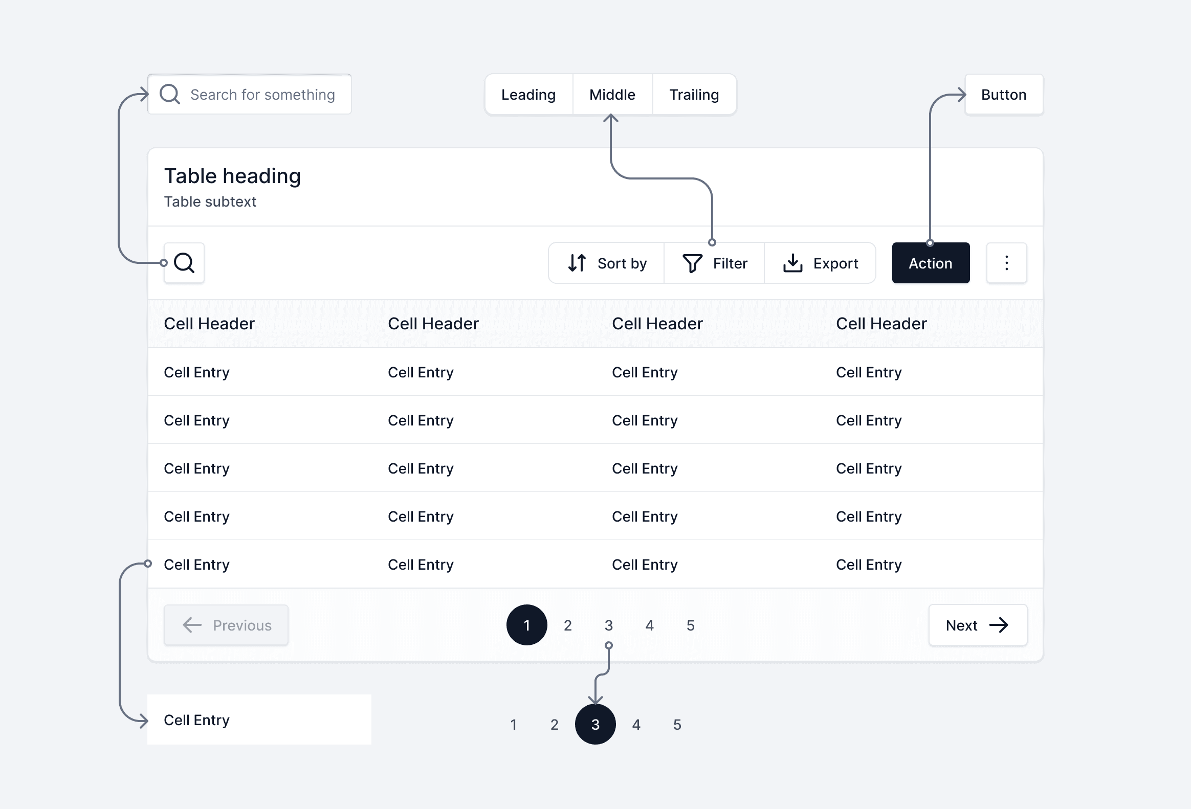
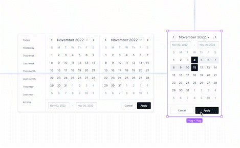
Tables were made smarter and easier to use
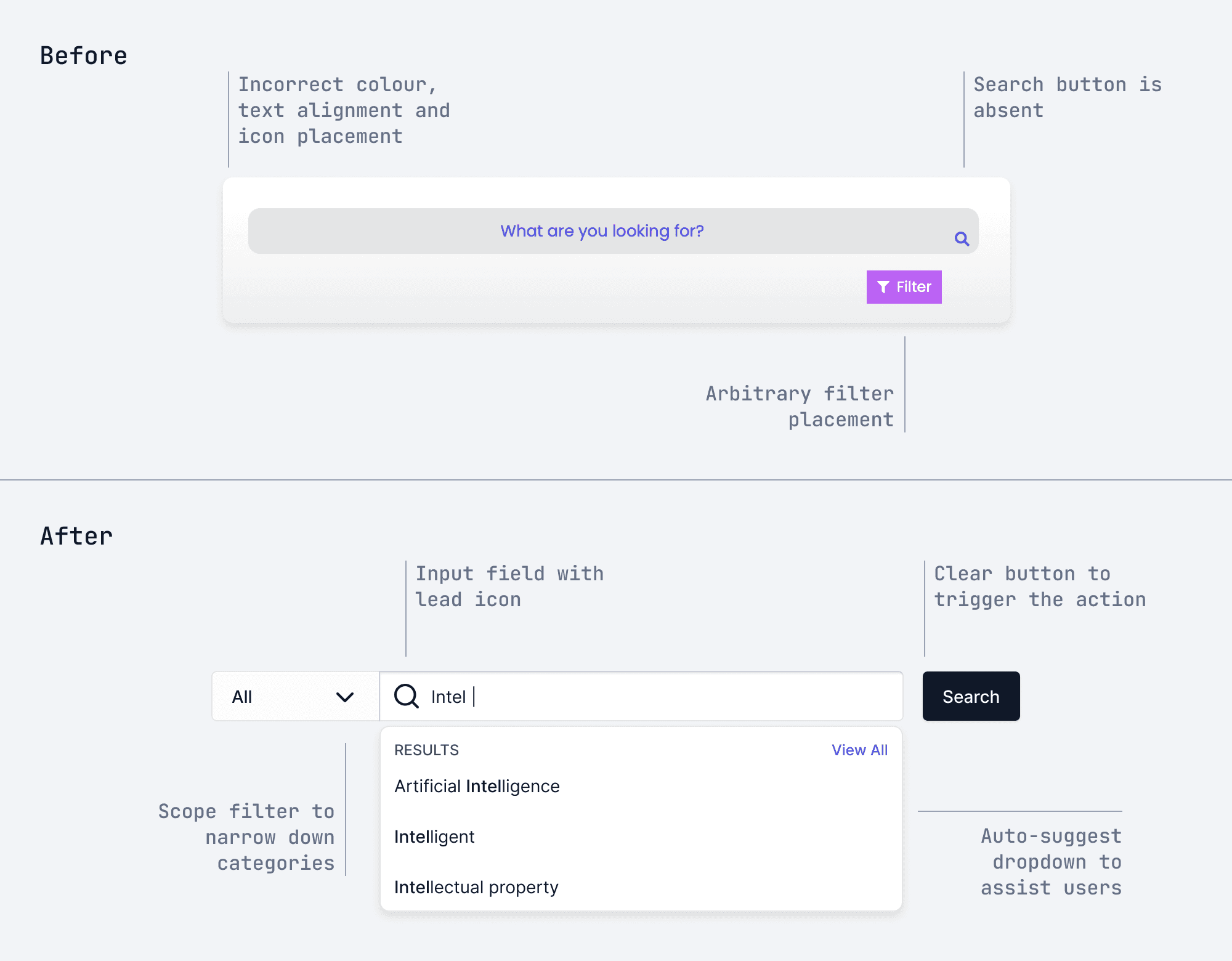
Search experiences were re-written with a clear sequence of events
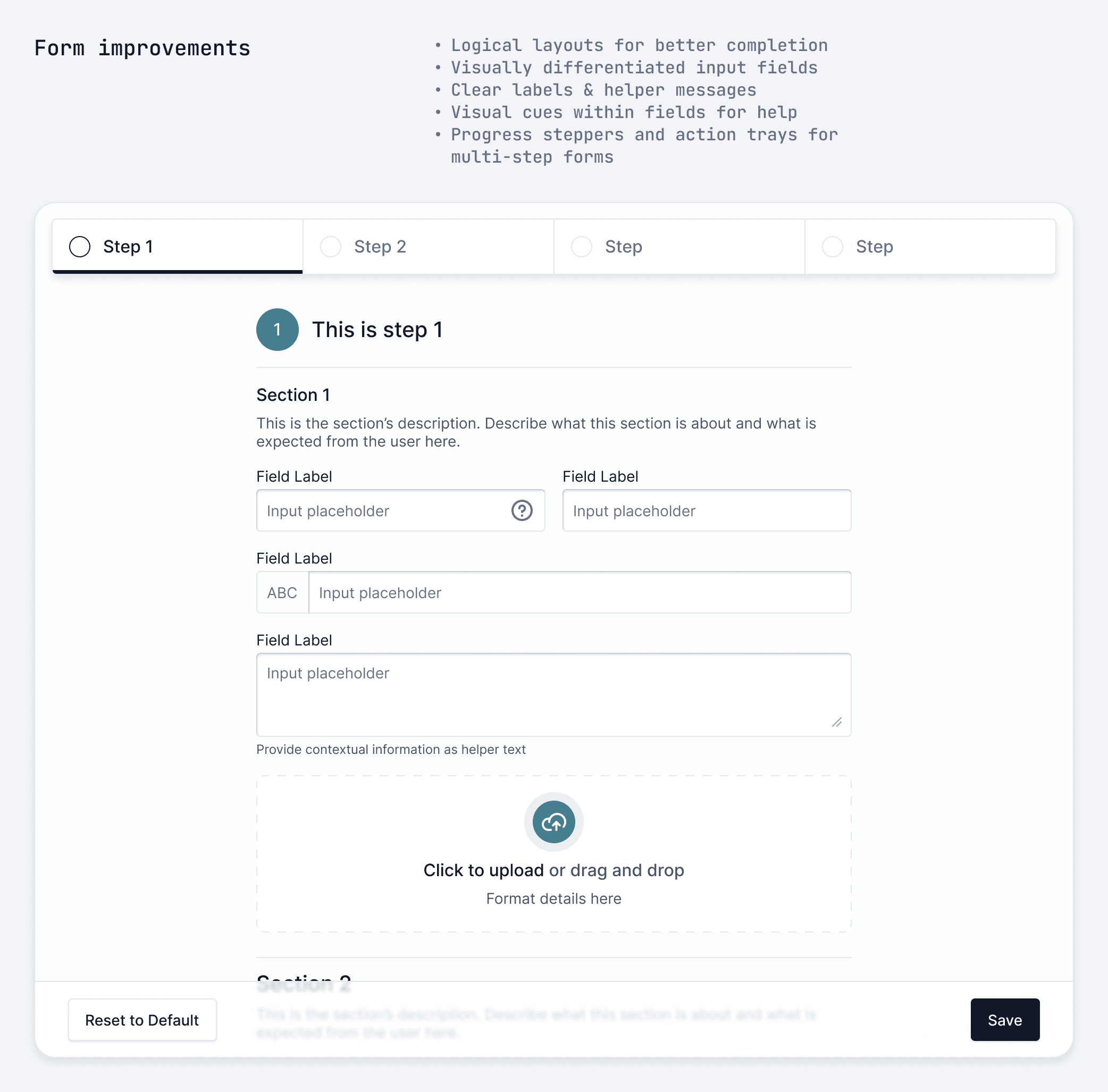
Forms were designed to be logical, finite and respectful of the user’s time
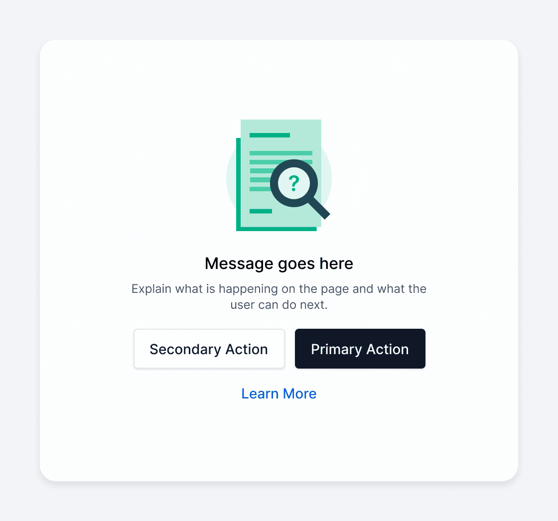
A basic anatomy for using illustrations within contexts
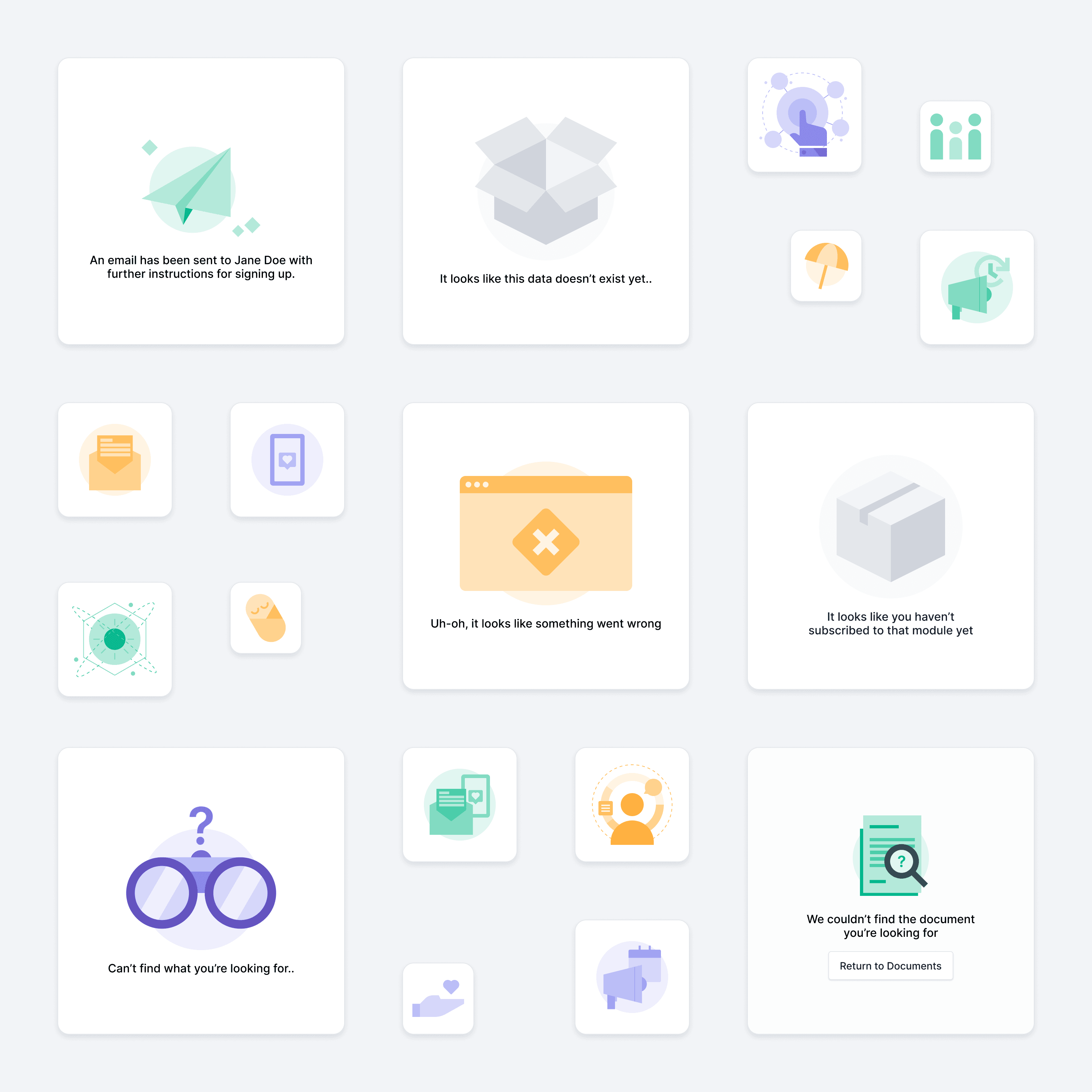
I also created an illustration library using Figma. The limited vector tools allowed us to create simple compositions at speed.
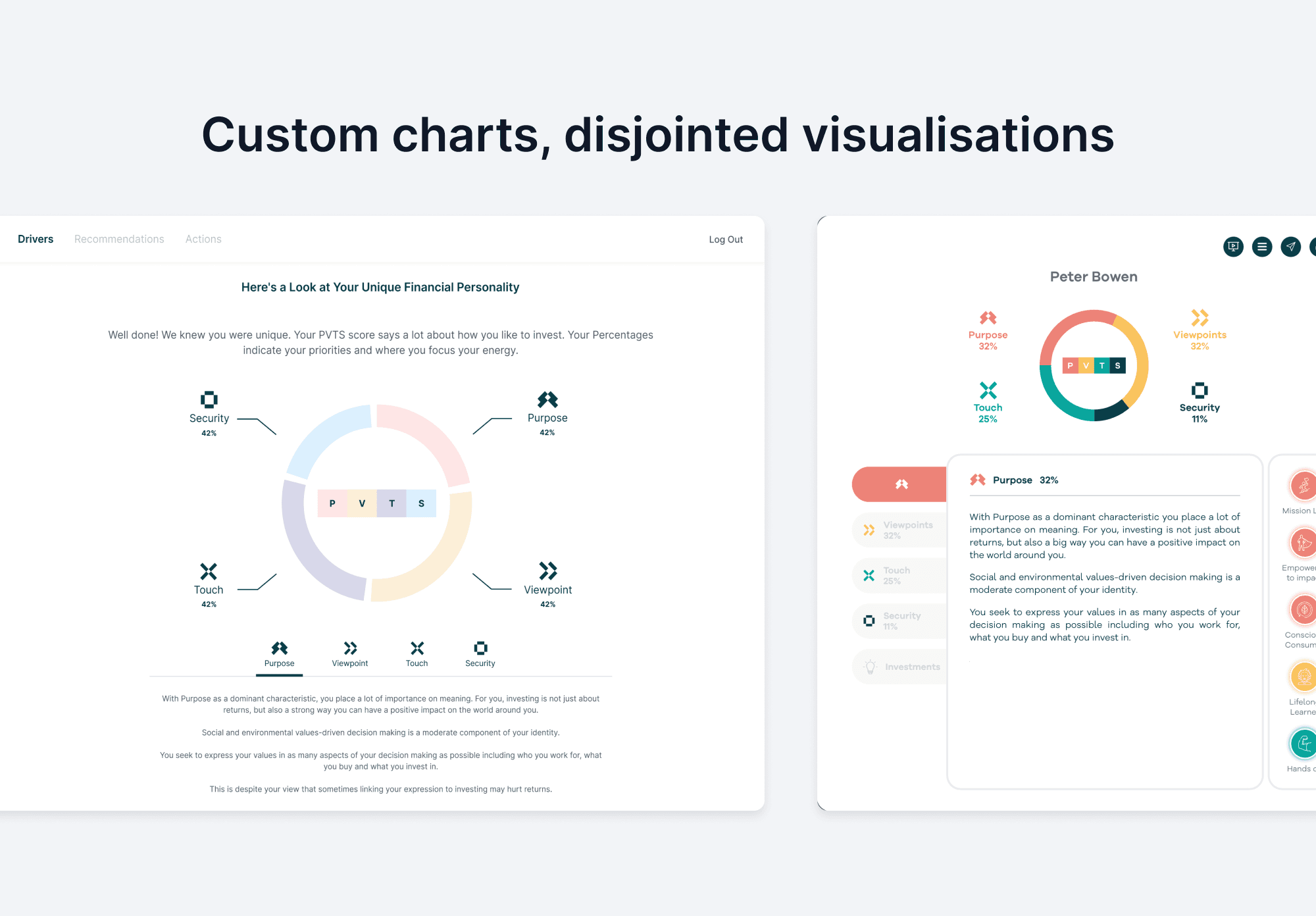
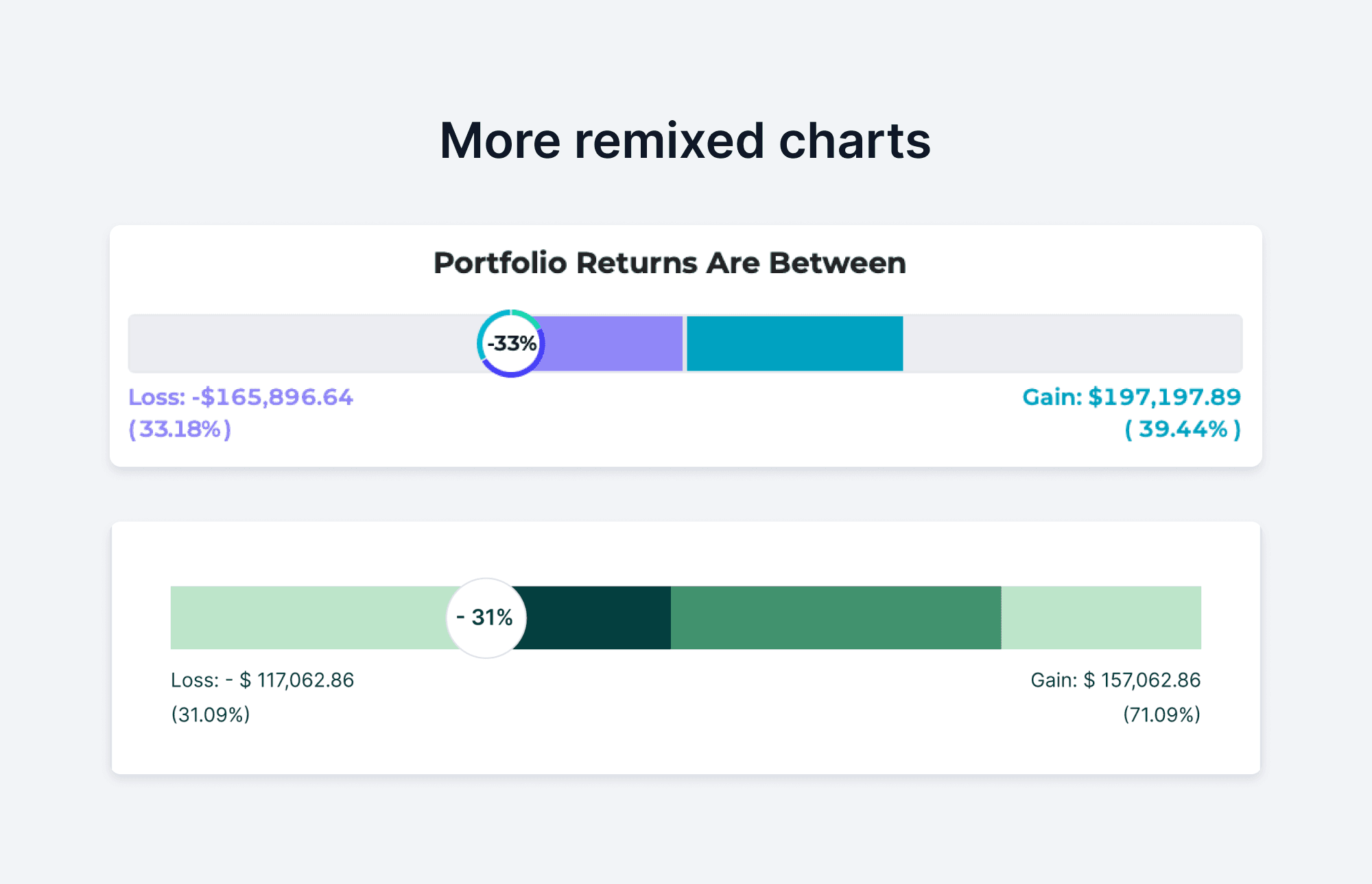
I created rules and chart components for data visualisation too.
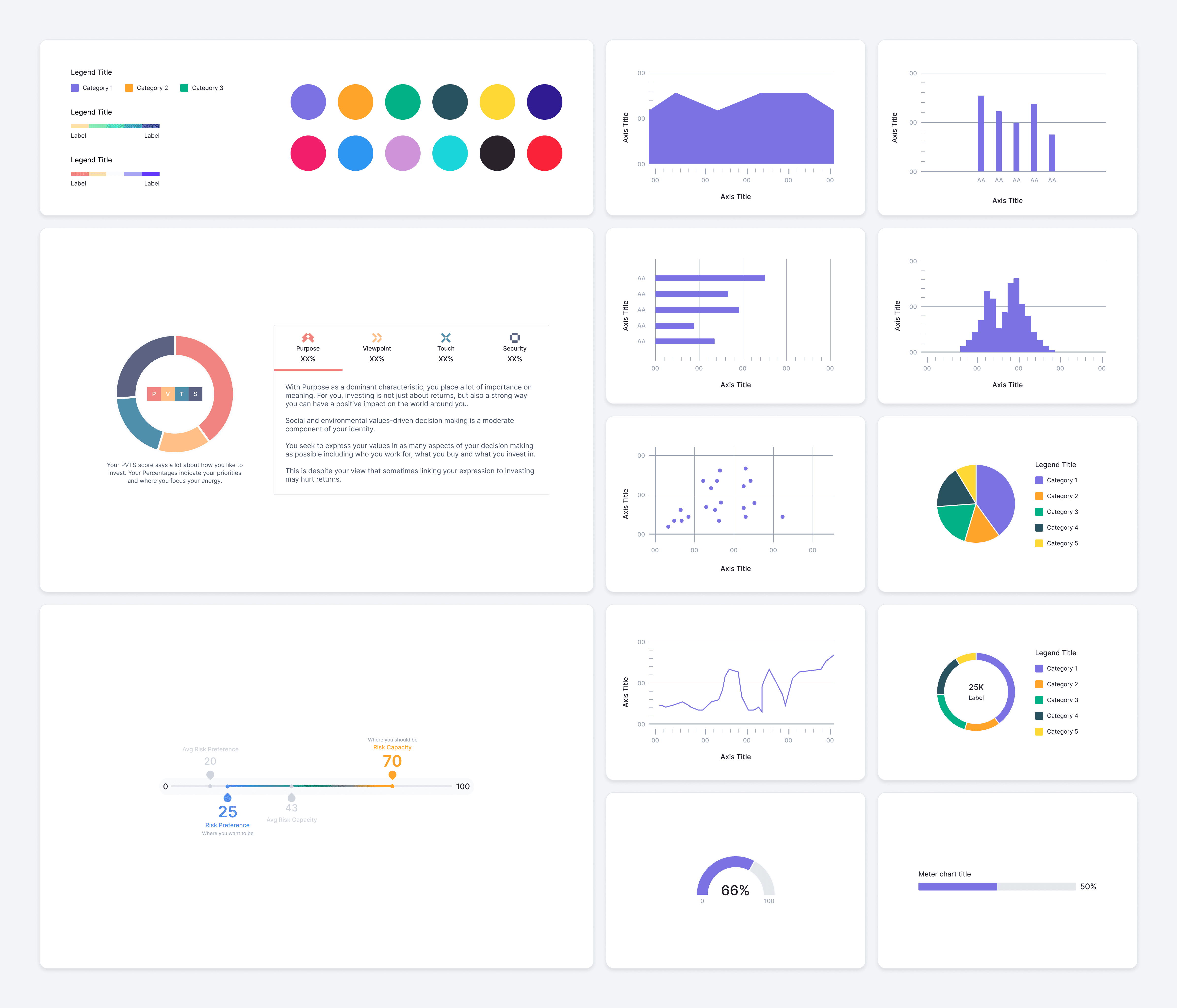
Our data visualisation included basic, advanced and custom charts.
In over 2 months, I had created a design kit that had an average of 50K inserts per month. I ran workshops and playground sessions to train the team in using the design system. This normalised the usage of the library and fast-tracked our designs.
But a design system alone does not a good product make
In the beginning, one of the main reasons I pushed to build an org-wide design system was because I believed that working with good tools would make us more efficient, which meant that we could focus on good processes. I quickly realised that having a design system does not alone create good experiences.
There was more to it, but here’s how I tried to address some of these issues.
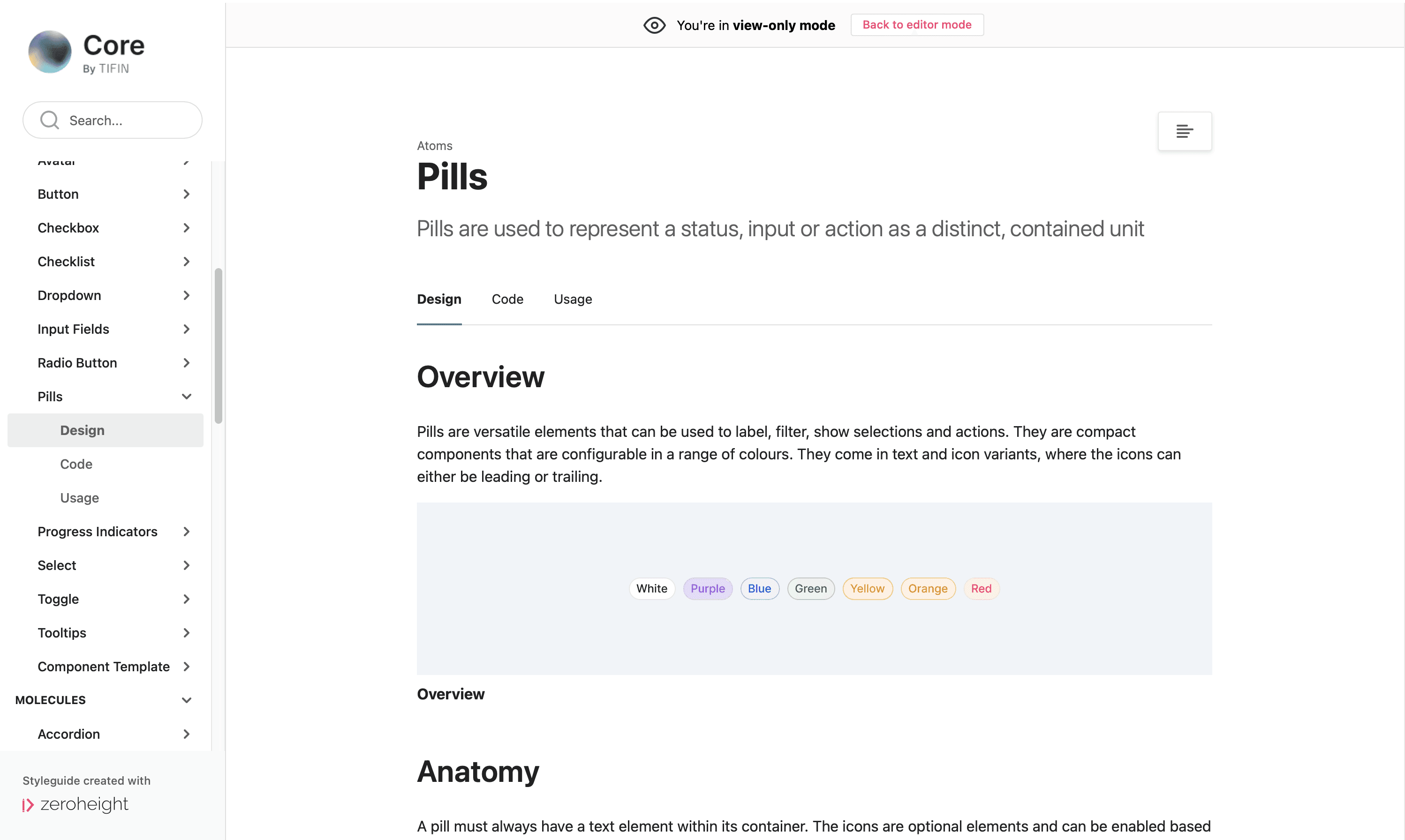
Designers, developers and other stakeholders needed a middle ground where they could gather. Somewhere they could set rules, inspect assets and understand usage.
Zeroheight let us do just that. I linked it to the Figma kit and continued to organise our components in the same manner. I wrote about anatomy, behaviours, and usage do’s and don’ts.
This gave us a clear picture of everything that we’d created. Once it was circulated, people from across teams began reaching out and asking for more clarity. If they needed to know how a nav bar should behave, they’d need me to write some rules. If they’d created a new type of chart, they’d ask me to document it. And eventually, they grew used to checking the documentation for all things UI.
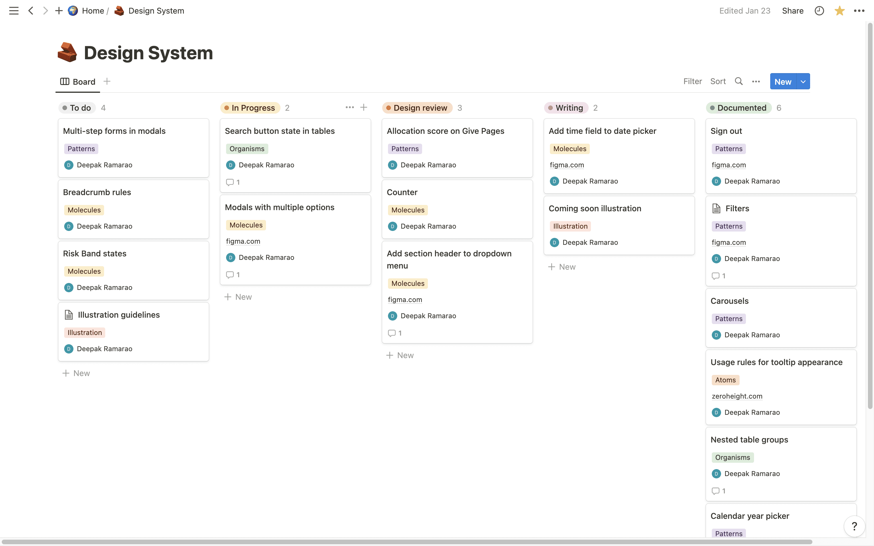
For maintenance, I created a tracking board for myself to see what needed to be updated or added. I used this to maintain links, design briefs and progress. I still use this from time to time.
🌇 The Outcome
At the time of writing, the design system documentation doesn’t yet contain any code. However, the decision to build a design system was a timely one. It is in continuous use amongst the designers today and it greatly reduces the time we take to go from idea to handoff.
I know this was a lengthy read but thanks for taking the time! 😮💨