
Antarctic Aliens
at National Institute of Design, Bangalore
Antarctic Aliens was a short data story I wrote as part of Amit Kapoor’s course on data storytelling. I had the chance to learn about the last wilderness and the threats to its isolated ecosystem.
This was an exercise in science communication. I relied on expert knowledge to form a compelling story about how the Anthropocene is changing the face of the continent, and everything that lives on it.
You can read the story here
My role
Information designer
Timeline
July 2024
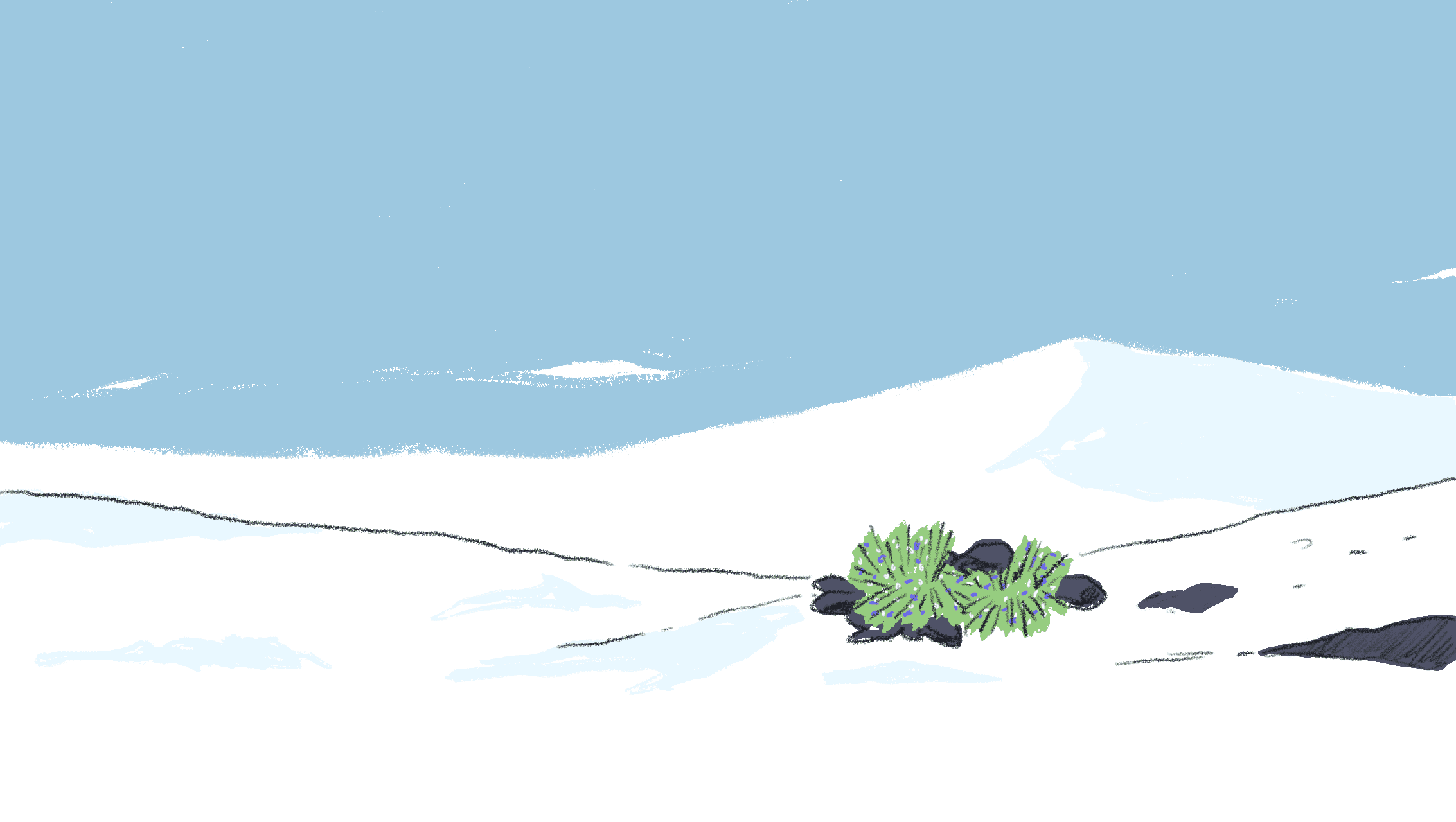
Antarctica has long been isolated and free of human presence. Its extreme climate and ocean have kept even non-native species away from the continent. This means that life on the icy end of the planet evolved to keep up with the severe cold. But in the past 100 years or so, human exploration has made it easier for hitchhikers to make it to the continent and gain a foothold. While the global scientific community values Antarctica for its secrets and innocence, humans have had a history of causing mass extinctions of native populations by exposing them to ‘alien’ ones.
I’m a nerd for these kind of stories and while my interest helped me understand the issue, I had to ask :
How do I communicate the urgency and scale of extinction threats, especially when it is seemingly unseen?
Antarctica is the perfect case study to understand the fragility of ecosystems and their killers : invasive species.
Just enough research
The best tool I picked up from Amit’s classes was the issue tree.
The issue tree helps break a question down into smaller sub-questions that can then be evaluated with a hypothesis each. That way, we can do just enough research to cover just enough ground on any given issue.
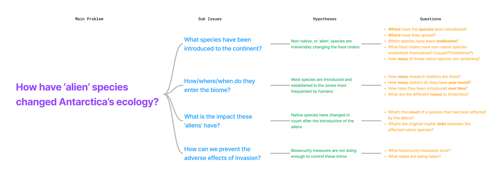
This helped me build domain knowledge along the right angles on this subject. The issue tree can be edited once we’ve learnt something new and our old hypotheses have become redundant. Once our hunches on these questions are strong enough, we can translate them into questions that can be answered with data.
What's the data saying?
My reading led me to this research paper and its attached database. It recorded every invasive species in the Antarctic and Sub-Antarctic regions. I took it to my Observable notebook to learn more.
Here’s what I found :
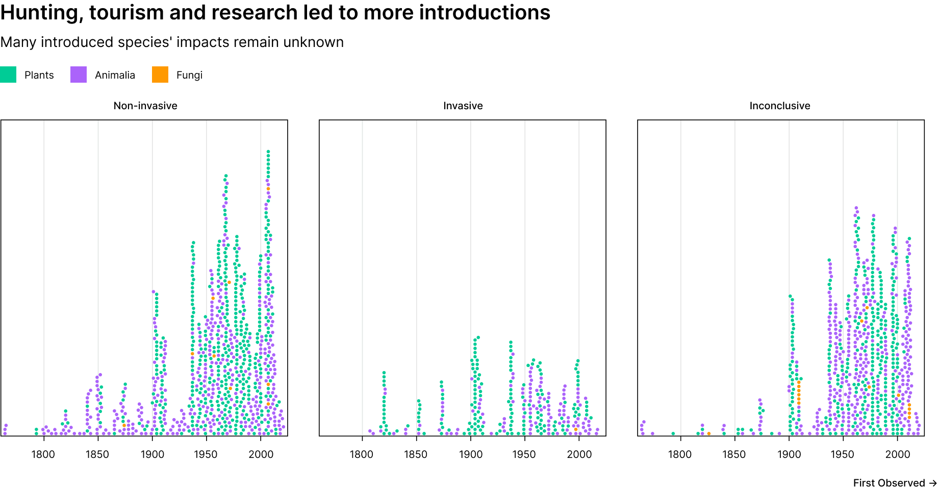
Most species have been introduced over the last 100 years, and we still don’t know if many of them have had an invasive impact.
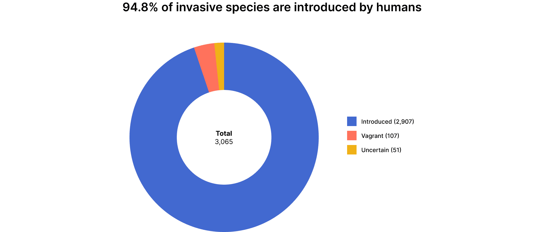
As suspected, invasion has been a result of introduction by humans and not by natural causes
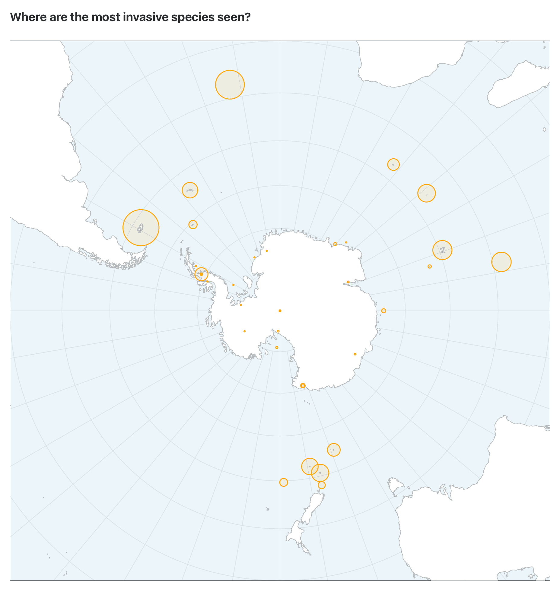
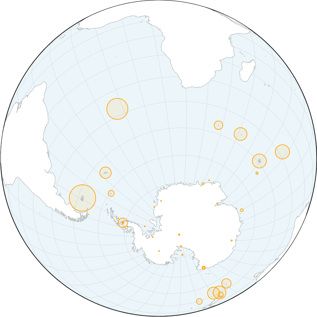
Most invasions happen around the sub-Antarctic islands which are gateway sites before entering the extreme climates of the South Pole.
These were all causes for concern because even one new species poses a threat to the stability of that region’s food webs. But to demonstrate that, I had to pick a few examples of how human interventions could massively upset inter-species equilibrium.
Story time!
My motto, while thinking about the story, was to show and tell. Well, more show than tell. I wanted to present cause and effect, the loops and links that are created between species in an ecosystem. This meant making the case studies the centrepieces in the story. Charts would complement the story and serve as evidence that invasive species are one of the biggest causes of biodiversity loss.
I made a rough storyboard to plan my explanation. It was necessary to walk through what ‘aliens’ are, how they get there, what their impact has been and where most of them are seen.
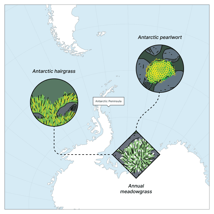
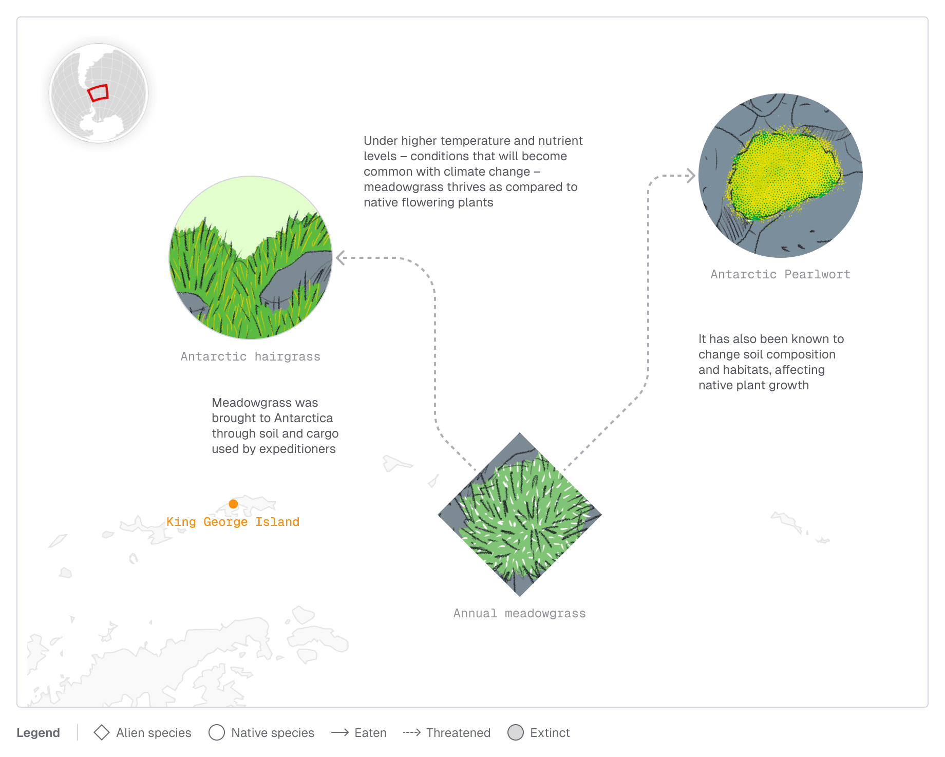
The food-web I initially designed was cryptic and did not say anything about the sequence of events, though I’d encoded the key into the preceding text. Some testing and feedback helped me learn that annotations need to baked into the visual.
I had to deconstruct the elements of the graphic and ask what needs to be given the most priority. In this case it was the food-web. The place was secondary, but still important. I took some cues from the masterful information design work at Nat Geo and moved the map to the top left. An inset and its place on the globe would do.
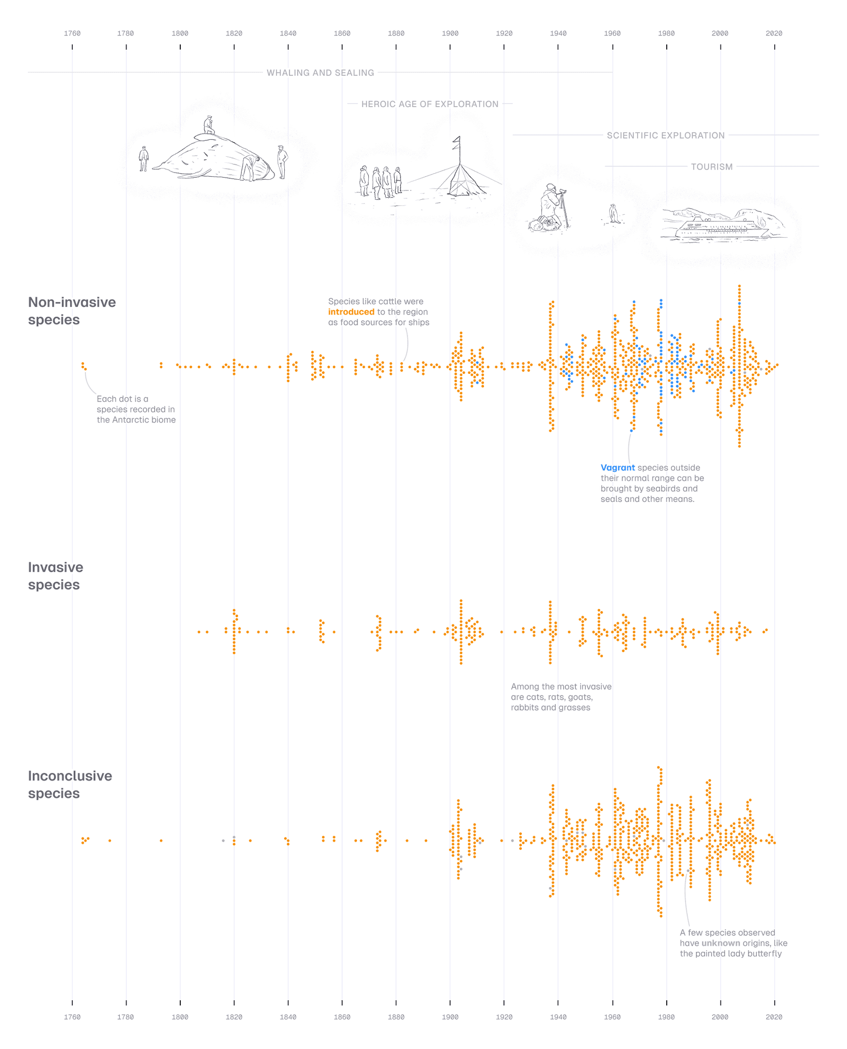
Seeing the timeline of species introduction in the biome definitely helps, but is there a way to add more context to it? Moreover, could we combine the data with the history?
What were the ages of human exploration? Which of these species were introduced, and which were natural?
I decided to combine all of this into a beeswarm plot that carried annotations, integrated legends and illustrations. This would give readers a complete picture of the sequence of the problem, and most importantly, the scale of human-assisted alien introductions.
For a bit of delight, what if readers got to explore for themselves what the bottom of the Earth looks like? Seeing as to how the Antarctic and Sub-Antarctic biomes are all below latitudes of 50-60° S, it felt right to give them an interactive globe to explore where the impact of invasive species was the most pronounced.
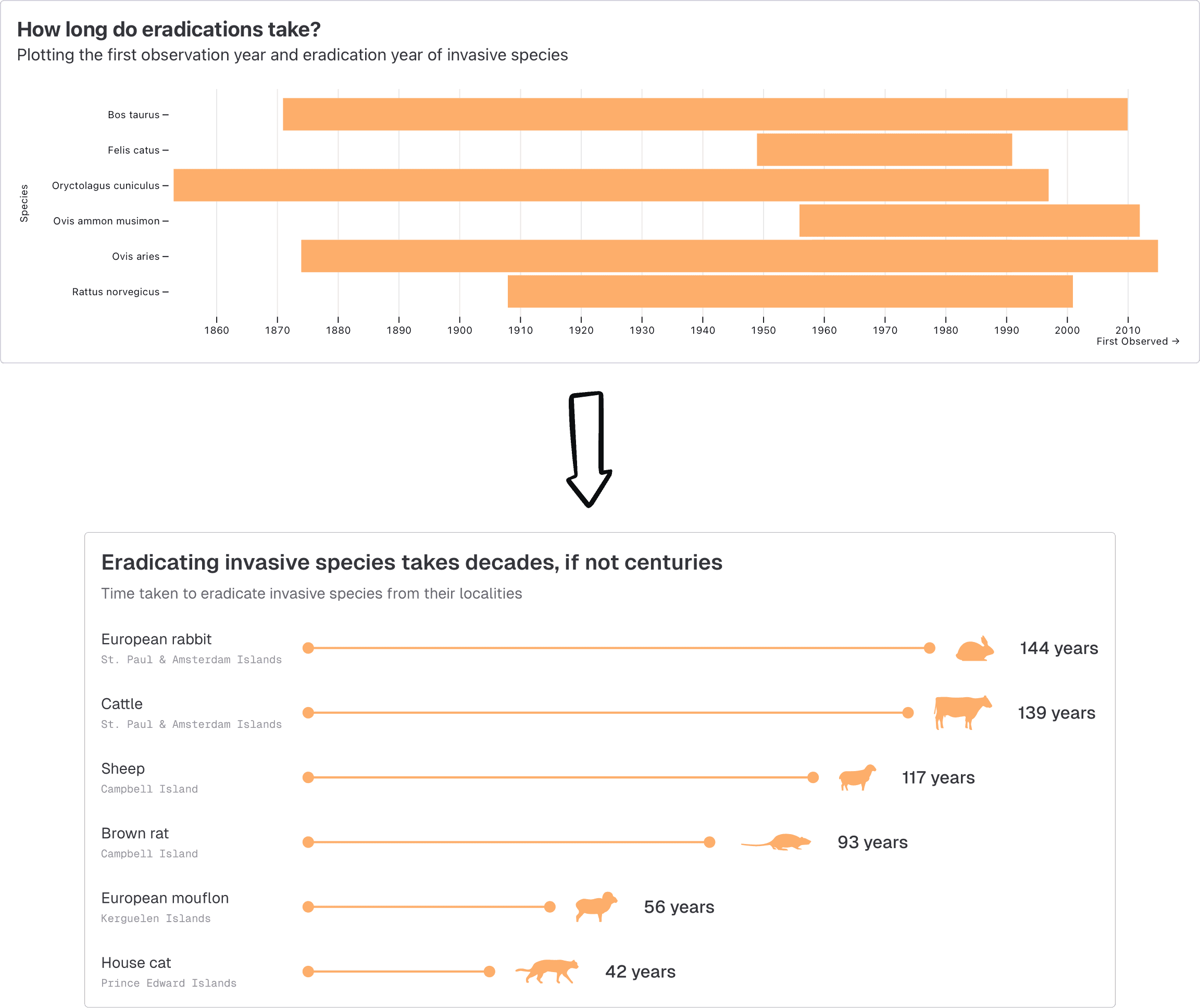
I also realised that the eradication timeline chart could drop scientific names in favour of common names. Silhouettes of species would also add more utility to the chart, showing those that stayed the longest. Also, I could respect the reader's time and show them which species took the longest to eradicate, since the decades are irrelevant for this point.
As finishing touches, I had some technical improvements to make. Making the site responsive for mobile and tablet sizes meant readapting some of the graphs and diagrams. I also had to figure out how to natively embed Observable Plot into my Svelte site.
Working on a science communication story was a test of my own abilities in breaking things down, visually and verbally. Sequence, cause and effect were crucial to keep the story engaging enough. Much of scientific research is at threat of staying illegible to the masses, unless we bridge the gap with a healthy dose of show and tell.