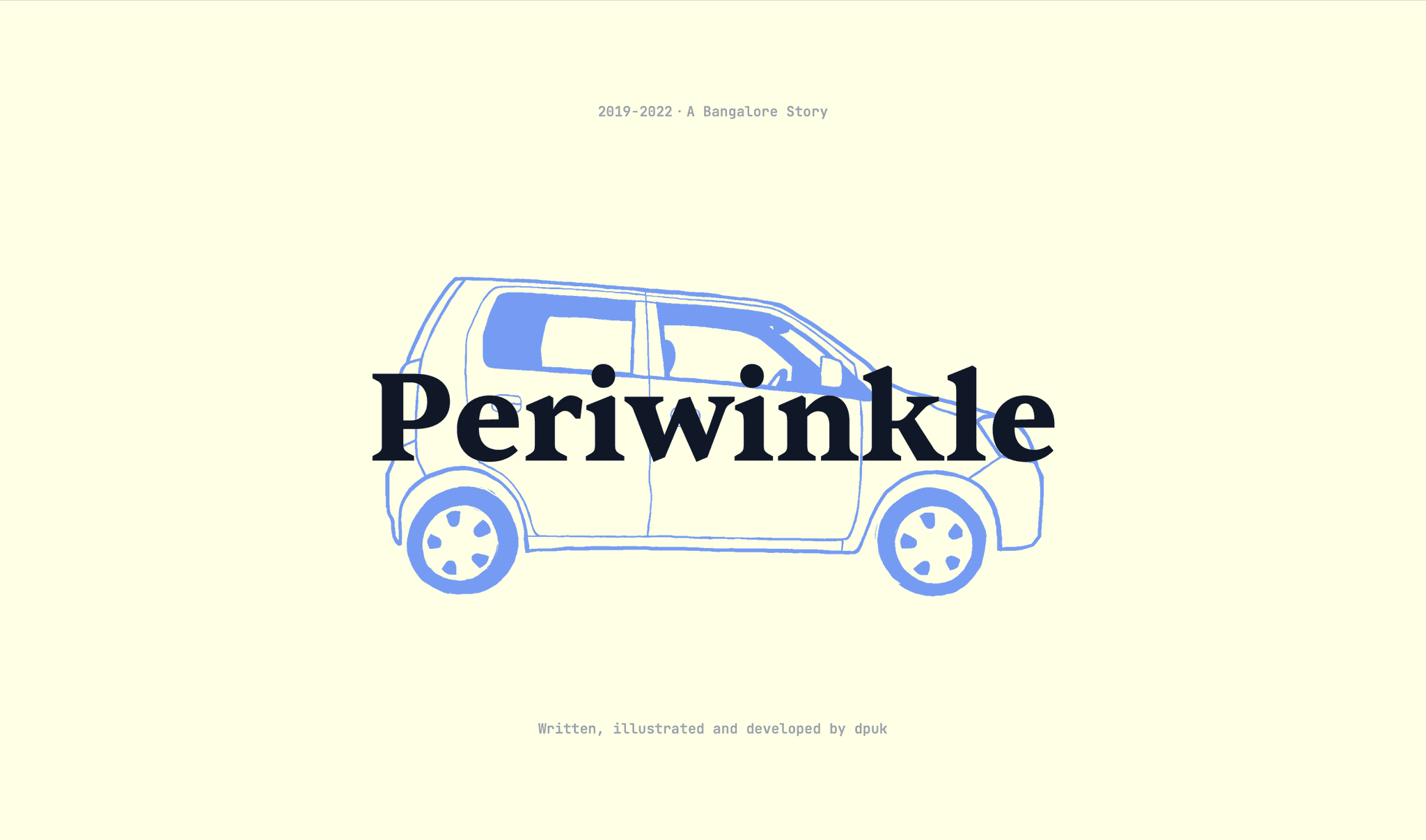
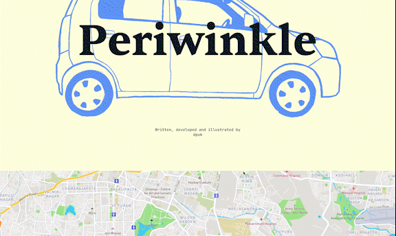
Periwinkle
I wrote a story about Bangalore, my playlists and my state(s) of mind, using listening data that I collected from Spotify.
You can read it here
This is how I went about it 👇
Data 🤝 Story
Since 2019, I had spent quite a bit of time driving around Bangalore. The more I travelled, the more I found myself remembering places by the songs (and feelings) that came on. I wondered if anybody else felt this way while traveling and listening to music. And so, like any reasonable person, I decided to create a dataset of such experiences, and make a story out of it.
As I recorded all of this, I found that I had a love-hate relationship with the city and almost four different lenses as I passed through it. I also realised that this was about turning the personal into the impersonal, and back again. Story to data to story again. I’m not sure if this passes as data humanism but I wanted to share it anyway.
💿 Records of records
Data! Data! Data! I can't make bricks without clay
- Arthur Conan Doyle, The Adventure of the Copper Beeches - a Sherlock Holmes Short Story
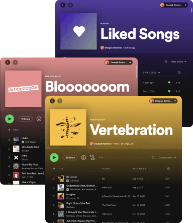
Thankfully, most of my clay was sitting in my Spotify playlists. I could comb through them to find out when I had added the songs, and then cross-reference it with where I’d been traveling at the time. Where was I when this song played? What was going on at the time?
But before I could answer those questions, I wanted to figure out why space and music came together to create such memories. Why do I remember things this way? I digressed, but I made some cool notes.
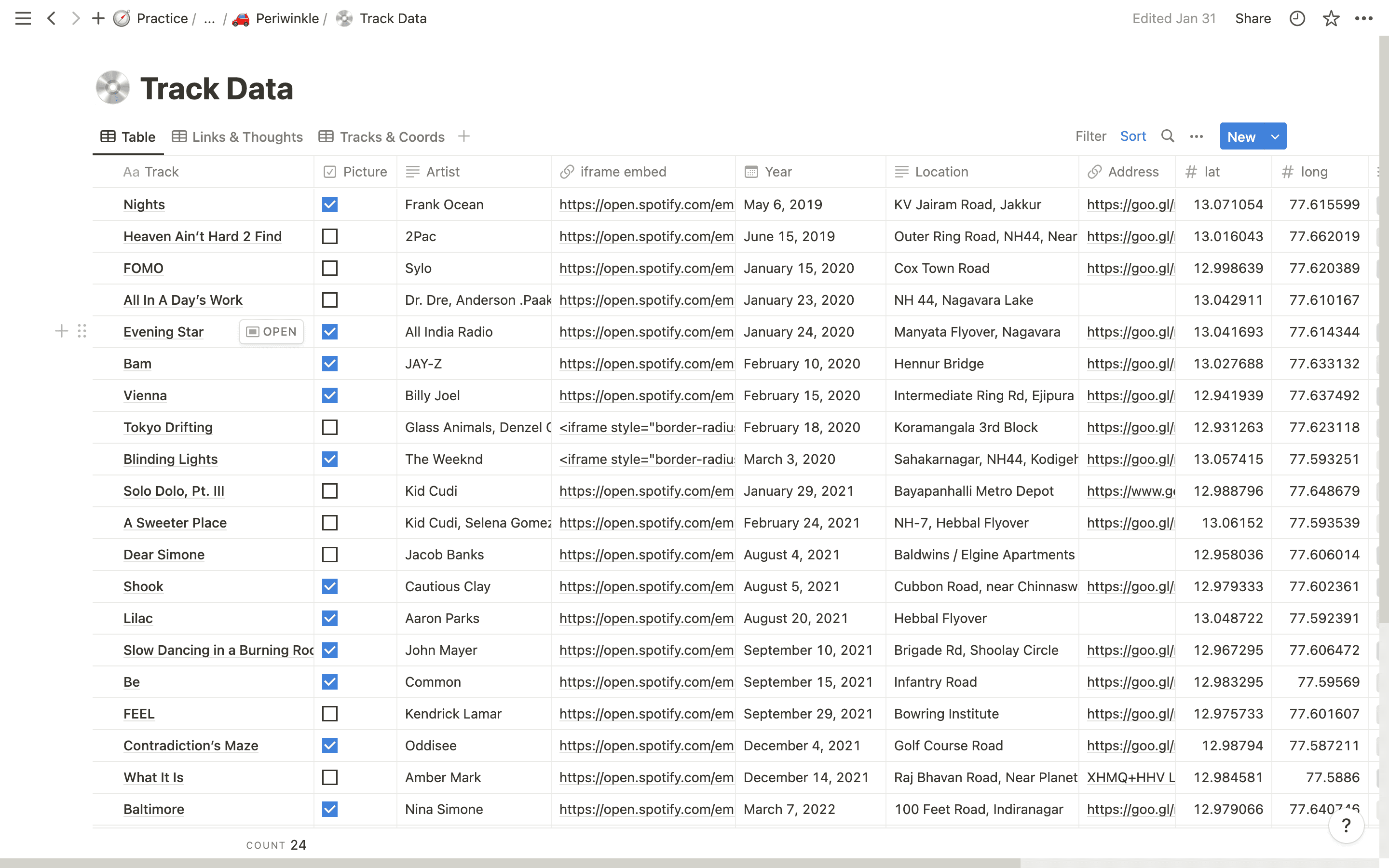
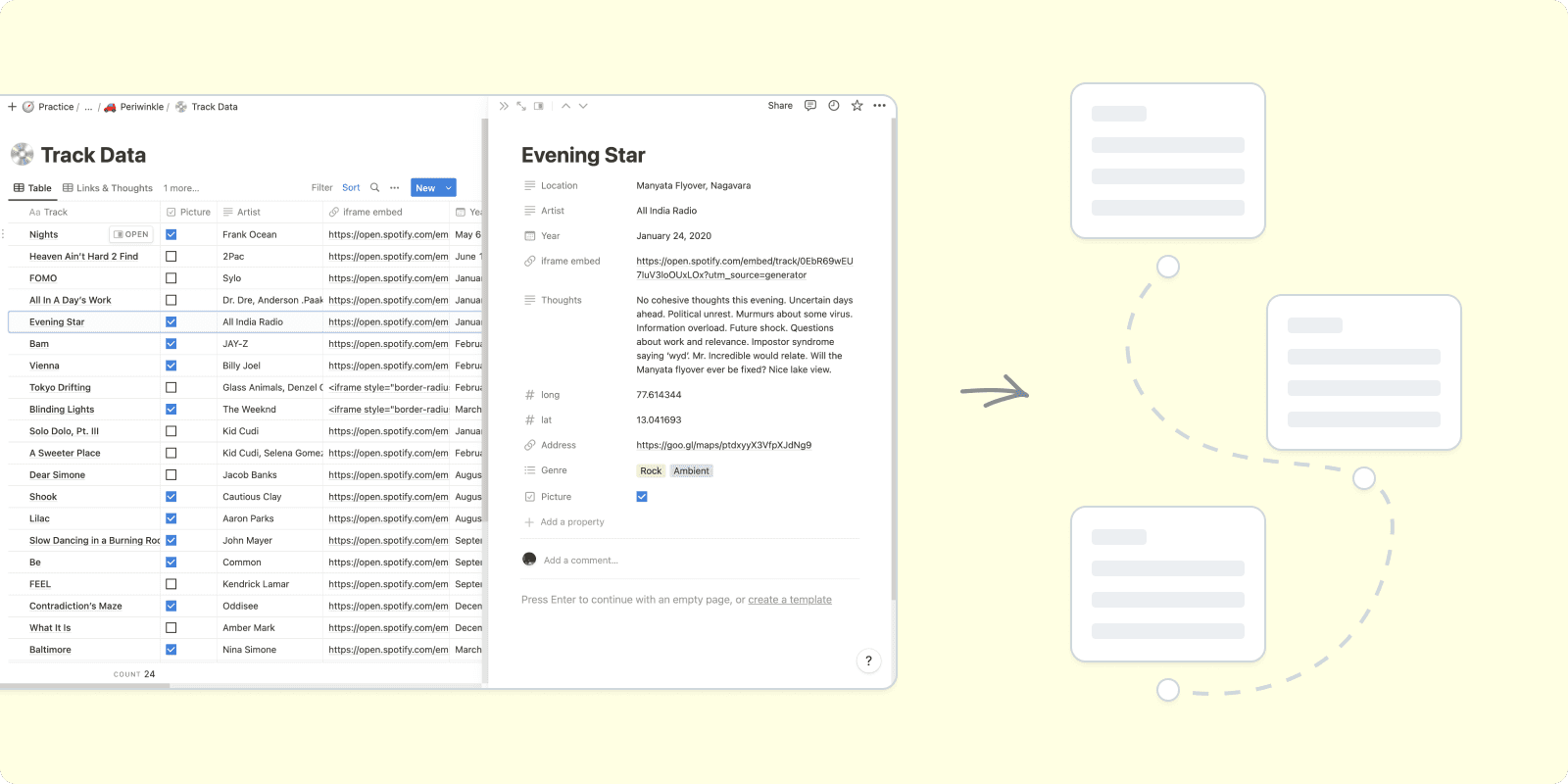
I created a Notion database to record everything I remember. The track name, artist, location(lats and longs), thoughts, Spotify embed links, year and even Google street view links. Sometimes the only way I could jog my memory was to drive and let my emotions remind me of the song and place.
This was a cyclical process and as I kept recording the data, I tried my best to place things as accurately as possible, especially when recalling my thoughts.
🗺️ Show and tell
A map had to be central to the project. Without a canvas to show readers, this would’ve been a stale experience. I had read my fair share of map based stories before, like the ones that Reuters and Kontinentalist produce. But because my knowledge of coding was a sum total of 0 at the time, I imagined different outcomes for this project, all the way from no-code to superfly scroll-throughs.
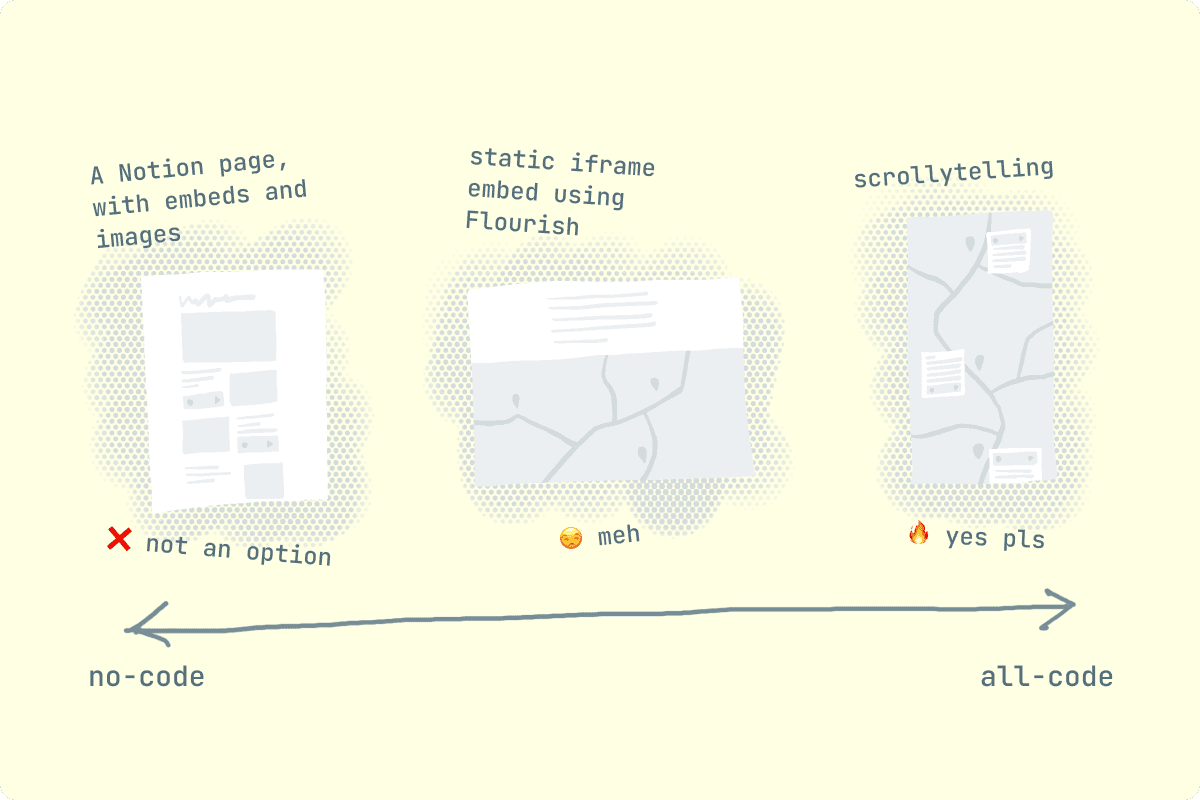
The last bit, the scrollytelling, is what I was really after. I’d be able to take the reader through a guided tour, while using the simplest interaction possible - scrolling. I used public resources made available by the Pudding to chart a path forward; I needed to learn some HTML/CSS/JS and some Scrollama if needed.
The Pudding has a really cool set of articles on making interactive visual essays
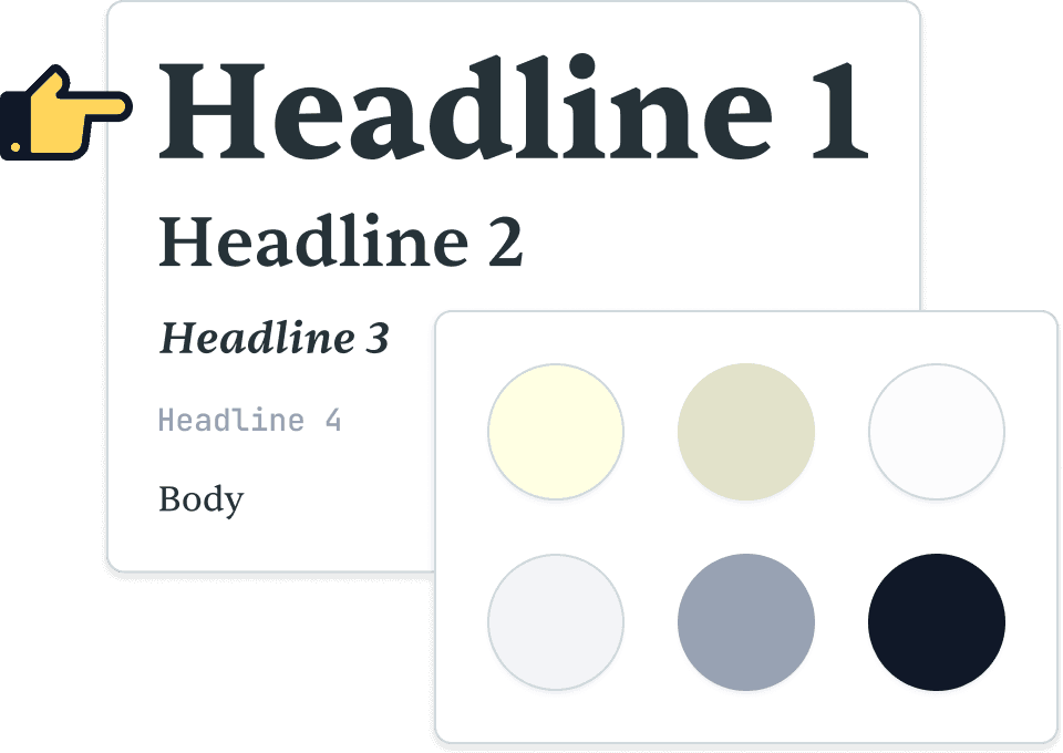
Before I jumped to coding, I made myself a lo-fi Figma prototype to test the flow of the story.
🧑💻 Nosedive
I took a month to pick up the coding skills I needed. I gave myself smaller tasks and Figma designs to work with. Eventually, I was ready to bring the prototype to life.
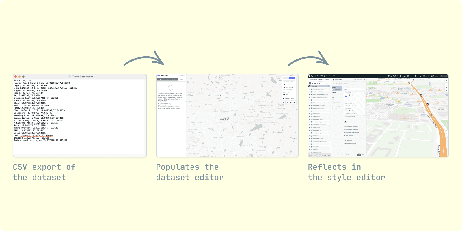
Which is when I found Mapbox, a service that provides mapping tools for a number of different uses. It turns out they had a low-code solution for map-based storytelling which was perfect.
I had to tinker with Mapbox’s style editor to learn what kind of data it accepts. A CSV file containing the latitudes and longitudes would mark those points on the map. I’d then be able to guide readers through the markers in the order that I wanted.
🧹 Tidying up
Once I was happy with the database, I selected the most evocative songs and wrote down what I remembered. I then started to see a timeline emerge, which helped me move the story from one point to another. I wrote the story directly in the Notion database, so that it’d be easier to revise.
I tried to avoid hindsight bias and stayed honest to what I knew in the moment. I drew from a wide range of influences, and my own voice while writing.
Shortly after, I exported the styles and assets I had set in Figma to the code. Assets like manicule markers could be transferred directly to the Mapbox editor
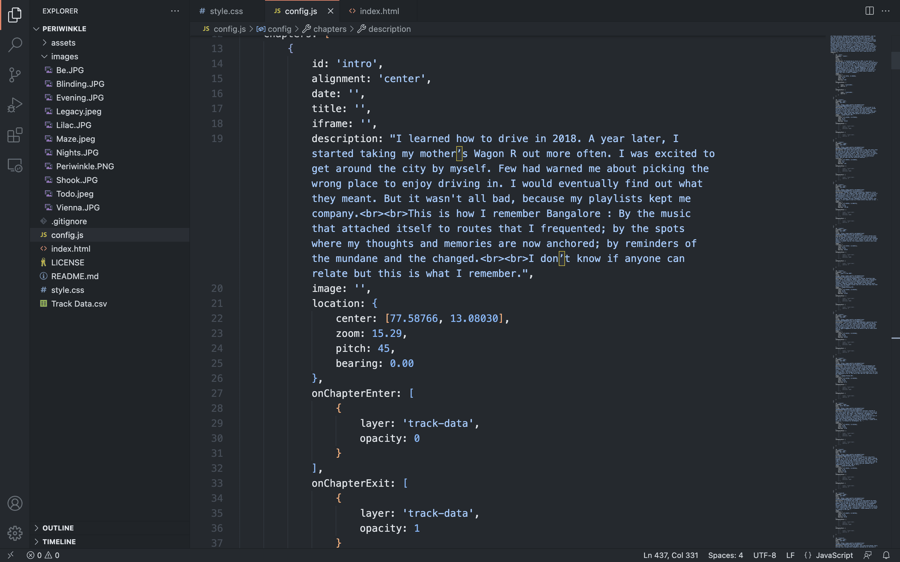
Once I added my data to Mapbox, the code template let me play with the camera angles. My knowledge of JS came in handy while manipulating the chapter objects to include Spotify embeds and images.
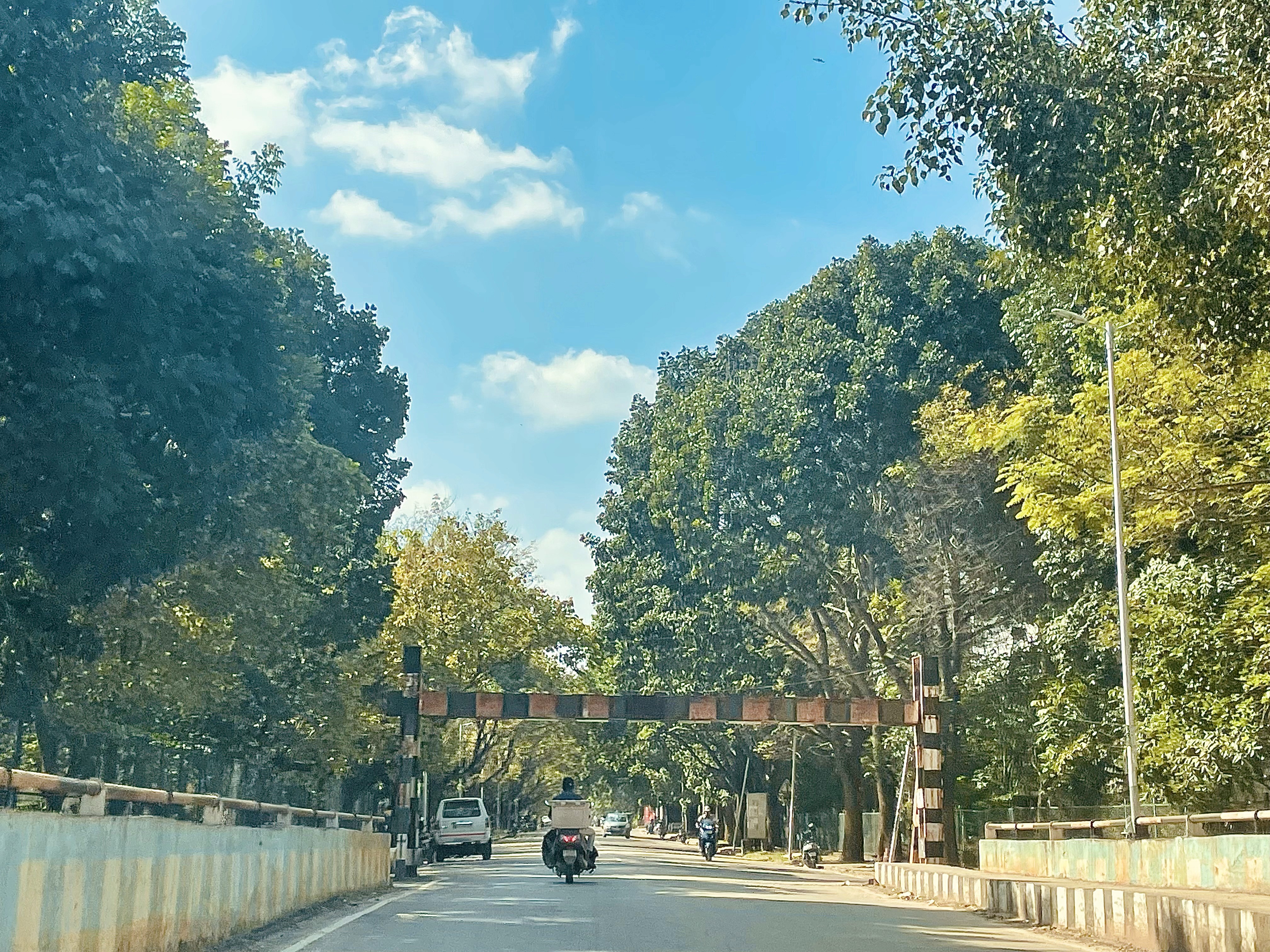
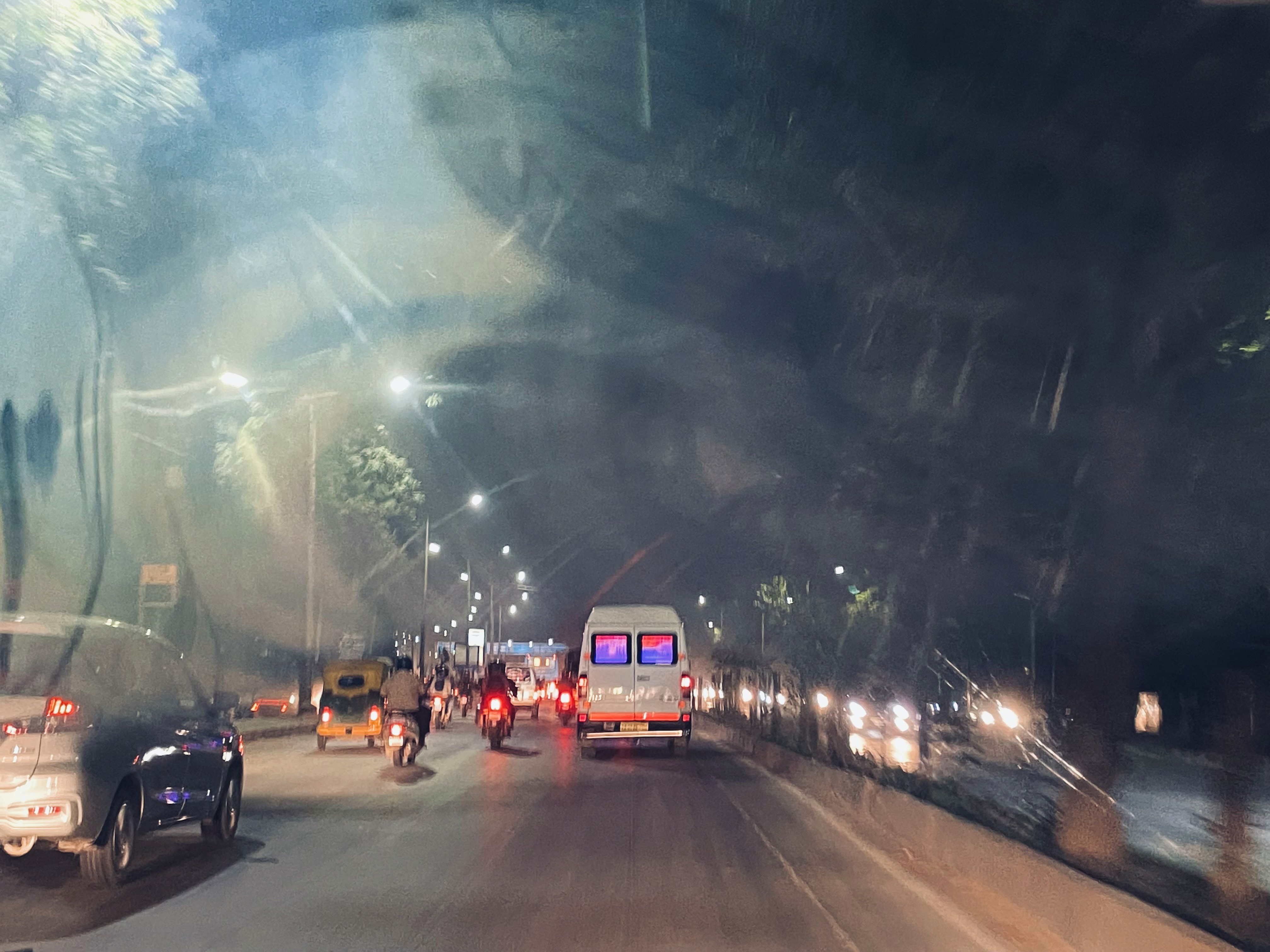
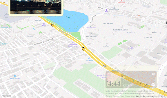
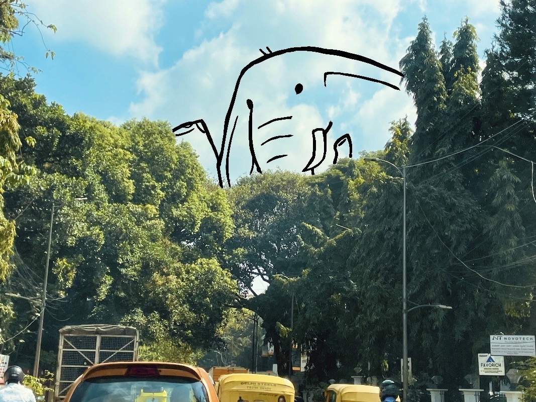
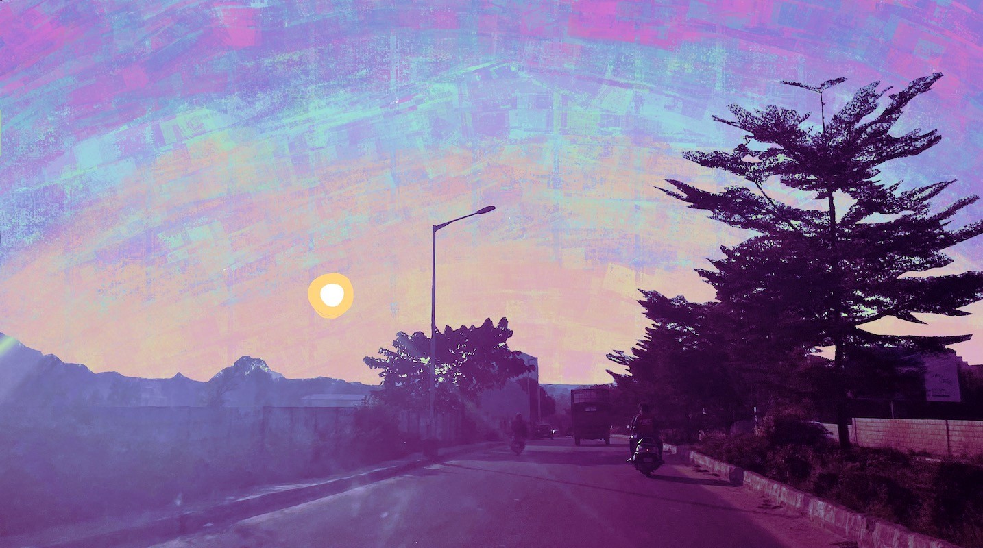
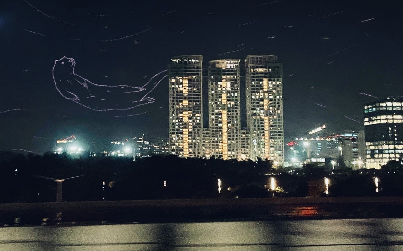
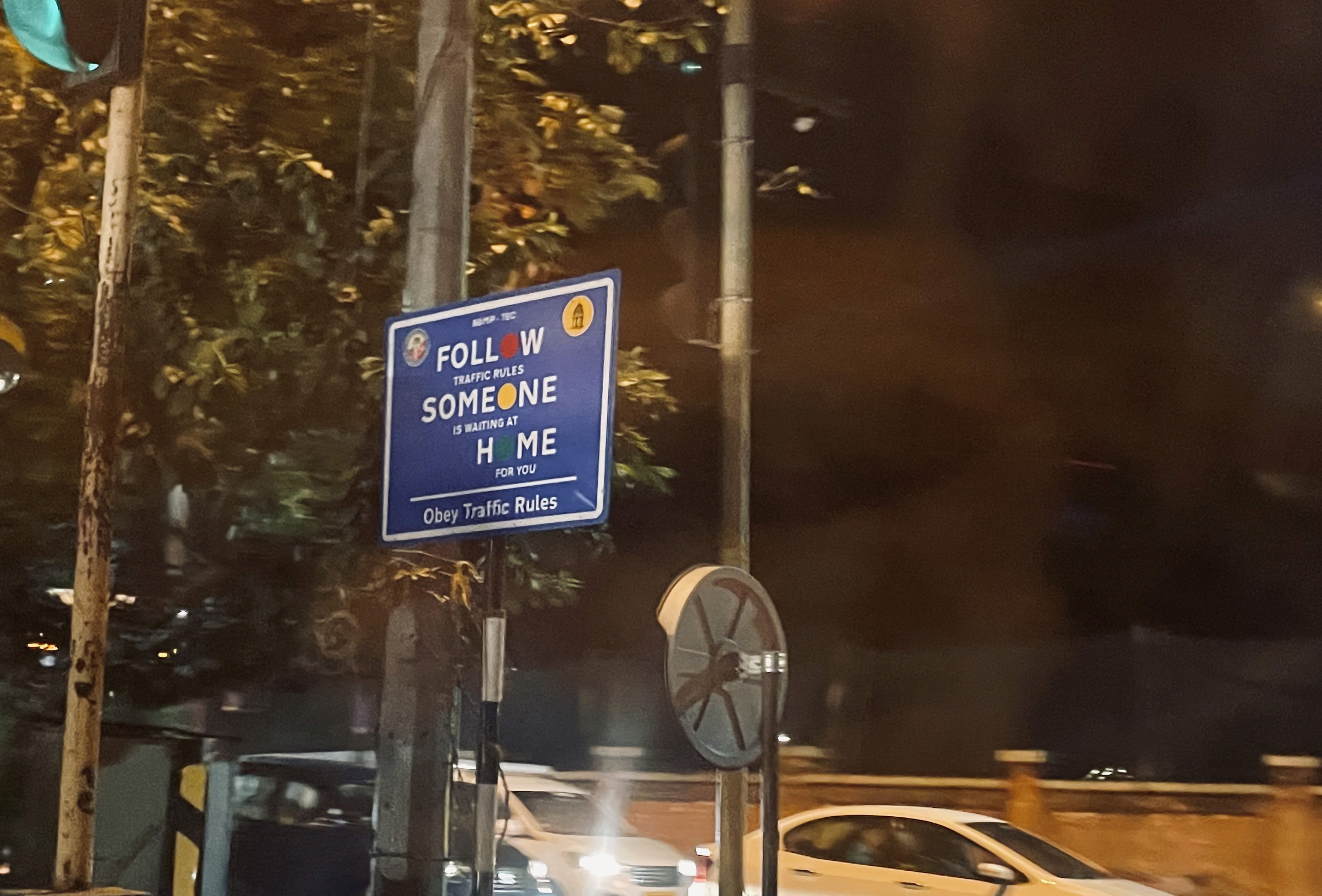
Speaking of images, I had to make multiple trips to capture Bangalore as I had seen it. Google street views weren’t cutting it and I wanted to make this a multi-sensory experience. I wanted to reflect on my own visual influences while illustrating on top of these pictures.
🚀 Sending it
After 2 months of tapping away at the keyboard, I was really excited to publish the story. I quickly picked up the basics of Git/Github and hosted my code on Github Pages.
The launch felt like a personal milestone because I’ve been raving about scrollytelling for years and this project was a chance for me get my feet wet. It also felt like the lines between data and self were so blurred, which is an intimate way to feel about data I guess?
Safe to say that I’ll be making more of these, with much larger (and cooler) datasets.
Thanks for reading!